|
|
Post by rlangner on Jun 21, 2006 14:24:03 GMT
|
|
|
|
Post by sonny on Jun 21, 2006 14:29:49 GMT
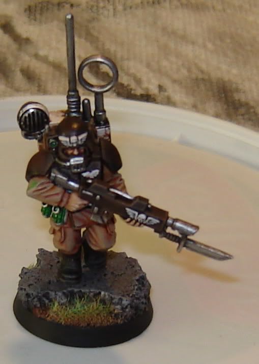
i like the cadian alot..
|
|
|
|
Post by rlangner on Jun 21, 2006 14:32:36 GMT
I'm putting two units of ten (one with alot of converting to serve as a command squad) along with two heavy weapons on E-bay once I finish, this guy is the first (somewhat test peice). I expect to do the rest to the same standard or better. |
|
|
|
Post by Tim C on Jun 21, 2006 15:09:17 GMT
Very nice work on the Cadian, the rock is looking good on the base of the Grey Knight marine, pic size is fine mate don't worry.
|
|
|
|
Post by jabberwocky on Jun 21, 2006 23:25:24 GMT
Strong work on the Cadian! Perhaps just a touch more highlighting on the shoulder pads, but this is certainly a very good tabletop piece at this point.
|
|
|
|
Post by rlangner on Jun 25, 2006 0:39:31 GMT
More done on the cadian, haven't done anything new with the grey knight because I'm still trying to work out a paint scheme...  Picture is a little fuzzy but I'm sure you get the point lol... Just the backpack left... |
|
|
|
Post by demi on Jun 25, 2006 6:32:43 GMT
the cadian fellow looks damn impressive! I had some cadians once - I used simuliar color scheme  well done! |
|
|
|
Post by scarifice on Jun 25, 2006 8:13:20 GMT
i really like the colour scheme of your cancadian. but there is one thing....on the reight arm of the man is a little green point(dot???). that is the only thing i dont like
^^
|
|
|
|
Post by rlangner on Jun 26, 2006 0:02:41 GMT
i really like the colour scheme of your cancadian. but there is one thing....on the reight arm of the man is a little green point(dot???). that is the only thing i dont like ^^ HMMM... I don't see it in real life, so I think it may have been the camera. I'm going to go over that spot again with my base color just to make sure I'm not just not seeing it. Thanks for pointing that out... |
|
|
|
Post by Tim C on Jun 26, 2006 2:31:36 GMT
Good spot scarifice, I hope you are right rlanger and that it is not on the model. This piece isvery well done, a whole squad of this quality would look good on the gaming table.
|
|
|
|
Post by angus147258 on Jun 28, 2006 0:41:58 GMT
That cadian is extremely inpressive. A whole army at that standard would bring chills.
Keep up the good work.
Jake
|
|
|
|
Post by rlangner on Jul 6, 2006 13:43:34 GMT
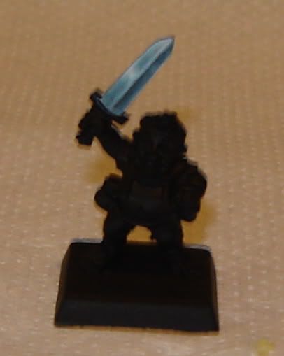
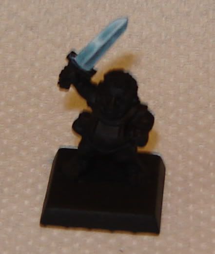
Working on four hobbits for my stores painting lessons, each one will be painted to one of the levels of the lessons (the levels are Grot, Ork, Nob, and Boss). This one is going to be the Boss display model. Still working on the NMM, it looks far better in the pictures than in real life... It's my first serious attempt at it, and I think its going well.   |
|
|
|
Post by Tim C on Jul 6, 2006 13:52:17 GMT
Looking good the sword blade looks excellent even though the picture is a little blurred, might I suggest that you move back a little from the model as that is making the picture less sharp, I realise hobbits are small I have painted a few myself and have a few more to do, your camera has an optimum distance for the macro to be affective, minie is around 20cm I usually measure the distance before setting up the shot. Anyway look forward to seeing some more progress soon.
|
|
|
|
Post by rlangner on Jul 6, 2006 13:57:01 GMT
Thanks Tim, but I think the picture is blurry because I just snapped the photos with camera in my hands (not on a tripod or anything). The distance was well over 20cm, I just cropped the images after. I'll get some better pictures once I get more done. I find that Whenever I try NMM it always looks extremely cartoony. I haven't managed to achieve the darker looks that alot of other painters can achieve. I still think I can do just as good with real metals, and I think I'll probably just stick to those for the most part.
|
|
|
|
Post by Tim C on Jul 6, 2006 14:06:53 GMT
Yeah I am not an nmm master and much prefer to use real metals myself.
|
|
|
|
Post by jabberwocky on Jul 6, 2006 18:43:28 GMT
I think you have gotten a good start on the NMM. I can't offer much critique myself, as I too am a metallics guy.
|
|
|
|
Post by drizzt on Jul 6, 2006 19:31:42 GMT
If you care, I start with some dark gray mixed with a bit blue just enough to make it blueish. Then I start highlighting moving to a lighter gray, and finally to VMC flat alluminum. My most effective nmm to date is the one on Marco Colombo. I think the key to making to more real is to use both very dark and very light tones of gray and not keep it to lighter tones only.
I'm by no means an expert or even good at nmm, but ppl told me marco colombo's plate was effective so I thought I'd share it with you. And of course... the actual placement of highlights is very important (and I'm still not very good at it)...
|
|
|
|
Post by menace on Jul 10, 2006 7:45:28 GMT
Clever basing on the grey knight, adds drama to the pose, and i like your style on the Cadian, beautiful metals... just wondering why switch to nmm on the hobbit, or is it just for a workshop practice?
|
|
|
|
Post by rlangner on Jul 11, 2006 17:59:34 GMT
Thanks for the comments Menace. The grey knight is also going to have large wings attached to his backpack but I haven't got around to that yet. The hobbit is done in NMM as a reference for my painting lessons (I'm also painting three other hobbits in varying skill levels). I figured it would be worth a shot, I'm not terribly pleased with the progress though... It looks good in the photos but in real life its rather lack luster.
I've been at odds with my painting lately. Nothing is good enough anymore, and I can't seem to do better. I've been working with alot of red lately, and I can't get smooth transitions like I used to. It's rather frustrating... Did a bit more work on the hobbit last night. I'll try to get some pictures up later tonight.
|
|
|
|
Post by Tim C on Jul 11, 2006 18:06:13 GMT
I know what you mean about struggling to get smooth transitions, I have been struggling with my painting, but I seem to be coming out of it now so stick with it and you will get there.
|
|
|
|
Post by rlangner on Jul 12, 2006 4:44:40 GMT
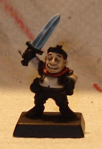
Got a bit more done tonight. I'm actually quite happy with him so far. Not the best picture. It's rather dark. Probably one of the best faces I've done so far. I need to do a touch up on his right eye though, it looks like a lazy eye right now. I'm alot more pleased with the transitions now. All in all he's going alot better than I expected.  |
|
|
|
Post by Tim C on Jul 12, 2006 7:38:07 GMT
Lovely work the face is brilliant.
|
|
|
|
Post by razhburz on Jul 12, 2006 8:04:21 GMT
he looks great mate!! the face is abolutely wonderful.
razh
|
|
|
|
Post by rlangner on Jul 12, 2006 18:45:25 GMT
Thanks for the comments on the face, I am very pleased with it right now. The photo actually does not show alot of the detail that I put into it though, I'll try to get a better photo next time I take pictures.
|
|
|
|
Post by menace on Jul 12, 2006 21:32:13 GMT
Lookin' good .... reminds me of shrek!!! I'm totally with you on the painting hang ups, i don't know whether it's the change in weather or what but i seem to be doing a lot of glazing to 'tidy up' blending and taking far too long over it. I don't know if it's because we become more self critical either... good time to get the dice out or just paint a lot of fiddly details  |
|