|
|
Post by roguetrader on Apr 12, 2007 16:58:02 GMT
looks better now it has sand, still looks like it will draw alot of focus, but like you say the termie has alot of eyecatching detail on it anyhow
|
|
|
|
Post by Tim C on Apr 12, 2007 17:00:52 GMT
Nice I like the green alot.
|
|
|
|
Post by razhburz on Apr 12, 2007 19:32:21 GMT
yeah I agree with Tim. the green is really cool  |
|
|
|
Post by racssirt on Apr 13, 2007 8:37:27 GMT
Yup, it's looking great! And I agree with th others, the green is very good!
|
|
|
|
Post by mutantpotato on Apr 13, 2007 10:43:41 GMT
Wow the green is just awesome. How did you paint it? And with what colours? It looks just like how I want my dark angels armour to look ;D
|
|
|
|
Post by rlangner on Apr 14, 2007 3:31:31 GMT
Well the photo is a little deceiving but the green was (this is how I did it, NOT how I'd suggest doing it in retrospect):
-snot green
-glazed down with dark angels green, and black ink (to the point where everything was darker than DA Green)
-highlighted up with DA green on edges
-DA and snot green on edges
-snot green on edges
-glazed down with DA green
-glazed down middle areas with DA green and black ink
-snot green on edges.
I'd honestly suggest starting with DA green, working up to snot on the edges, glazing down with DA green, and then glazing down the middle areas with DA green and black ink.
I've got the lightning done, more on the base done, and started the replacement head of the staff, no pictures as my camera isnt liking anything I've done lately... That and touch ups still needed. I'll probably update tomorow with a wack of pics (but don't hold me to it lol).
|
|
|
|
Post by rlangner on Apr 15, 2007 18:38:35 GMT
Ok heres a wack of pics for you, I've got a bunch of mid progress shots of the base but really they're rather uninteresting. So here we go.  Front shot on base 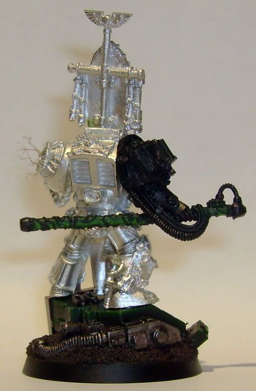 Back shot on base (staff is supposed to be a green gem, I'll wait to add the white spots till its glued in place, that way I am sure I dont misplace them) 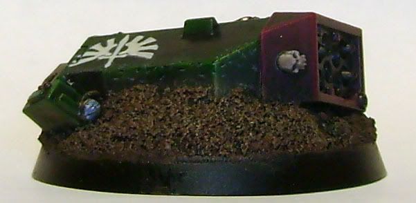 Clearer shot of base, before I added the scratches to the icon. 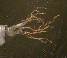 Lightning hand (hard to get a good shot of) |
|
|
|
Post by roguetrader on Apr 15, 2007 18:41:37 GMT
looking good mate, i really like the green and thelightninglooks good
|
|
|
|
Post by mousekiller on Apr 15, 2007 19:14:54 GMT
Wow, I bow to your abilities mate. That lightning is top notch conversion work, please tell me the secret... What material did you use to achieve that effect?
Also, that missile launcher is really coming along, really great work. I hate 40K (anything sci-fi really) but this guy is awesome.
|
|
|
|
Post by razhburz on Apr 16, 2007 5:36:27 GMT
Lookimg mighty fine so far mate  |
|
|
|
Post by Tim C on Apr 16, 2007 5:40:14 GMT
Excellent so far mate, the dread weapon arm is lookng fantastic, the battle damage looks realy cool although I think the lower edges need to be a touch lighter to make it convincing. Still subtle and well done.
|
|
|
|
Post by menace on Apr 16, 2007 6:09:46 GMT
Some inspired thinking here, the lightning hand is awesome, look forward to see how you tackle the osl
|
|
|
|
Post by mutantpotato on Apr 16, 2007 6:59:03 GMT
The lightning hand is just awesome, and the dreadnought arm is just great. Keep it up.
|
|
|
|
Post by armouredwolf on Apr 16, 2007 8:36:02 GMT
Great work , cant wait to see the finished project, fantastic job on the lighting, was thinking of doing something like that for my guy as well, guess ill rethink that ...
Top Notch!
AW
|
|
|
|
Post by racssirt on Apr 16, 2007 16:44:31 GMT
This is bloody brill mate!
|
|
|
|
Post by rlangner on Apr 16, 2007 21:27:18 GMT
Thanks for all the comments guys. I was slowly starting to lose enthusiasm for this project but reading what you all have to say has recharged my batteries. However, I have finals coming up and I really should be studying more so I might not be able to paint much for the next little while.
@mousekiller: I'll make a little tutorial on the lightning if I have some time later, it's sorta complicated to explain, but its a modified version of a technique I came up with for making rope. I have to admit like you I was a fantasy painter for a long time, and I didnt really get sucked into 40k til last summer, fantasy is still my favorite genre but I've painted so much in the past its a nice break to do something new.
@armoured wolf: I think you should still go for it, if you need some tips I'd be more than willing to help out.
Alrighty thats all I got right now, no updates on painting. Thanks again for all the comments, you guys make it all worth while.
|
|
|
|
Post by wolffang on Apr 17, 2007 19:22:42 GMT
Lovely work so far mate. I have this mini sitting atop my deck as well and would love to see how someone else tackles it.  Nice base, especially the green (which I'm going to have to steal, since I'm painting mine in a DA colour scheme.  ) and the scratches. Keep it up. Cheers, Wolf |
|
|
|
Post by rlangner on May 5, 2007 18:54:33 GMT
Hey guys. Sorry I havent updated. I was cameraless for the last little while so I couldnt take any more pictures. The librarian is done, and placed first at the local comp, so he's current at the Canadian GD. I'm excited, and eager to hear the results. I finished him just in time for the comp, but missed a couple details, and didnt have time to finish off some smaller aspects of him... I'll post pictures as soon as I get them. For now I'm taking a break from GW and working on some new minis from Anima Tactics. Great little game, some really cool models (well... most are, some are pretty off...). Here's the start of my Kronen model. I'm gonna be doing the armor in an orangey NMM like the character art.  with the sword:  The only thing done is the face, he's got a beard but it doesnt show up all that well, and since the sword tends to obstruct most of his face I'm not gonna worry about it. Sword isnt primed as there is a bit of a gauge in the blade I want to greenstuff over... |
|
|
|
Post by roguetrader on May 5, 2007 18:59:02 GMT
cool looking mini, i have seen some of the anima tactics and i agree that they are very hit and miss, some are great and some are bad, i have not yet pyrchased any though. cant wait to see how the armour turns out, and well done on your librarian
|
|
|
|
Post by rlangner on May 5, 2007 19:06:28 GMT
I think part of the problem is some of the photos the studio release are from really bad angles... Some of the ones that look bad would probably look fine with some slight converting of poses and what not. I wanted to do a dark force but the set was sold out so I picked up a light force... I'm picking up most of the range when I get a chance (it's fairly small right now, and only $10 a model), I can get more people into it if I have models to let them try it out with. I'm probably gonna end up with Empire, Church, Sammael, and Wissenchaft forces... I'm super stoked for their third wave of minis... *Drool* phildeb.files.wordpress.com/2007/04/photo-005.jpgphildeb.files.wordpress.com/2007/03/wissenchaft_gunner-1.JPG |
|
|
|
Post by rlangner on May 5, 2007 20:00:37 GMT
Heres a quick test peice for the NMM. It'll be very similar but I think there will be more areas that get fully lit, and more areas that dont get lit much at all. 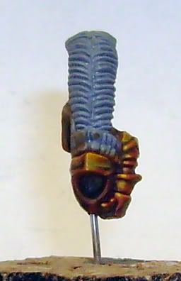 |
|
|
|
Post by Tim C on May 5, 2007 20:04:03 GMT
That is really nice mate, the mini itself is not to my taste but the orangy nmm is cool.
|
|
|
|
Post by roguetrader on May 5, 2007 20:16:33 GMT
that looks nice mate, ill be watching to see how the minis ( when you get them all, lol ) turn out under your brush
|
|
|
|
Post by rlangner on May 6, 2007 21:39:20 GMT
Ok well it looks a little messy but here we go; 1: Graveyard Earth Basecoat 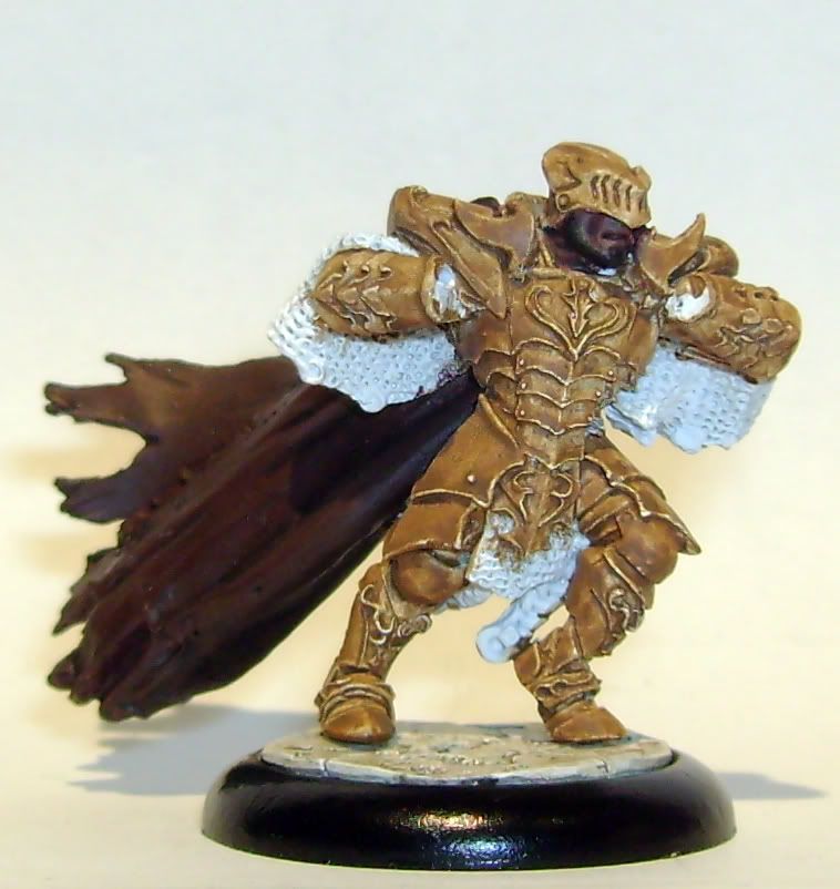 2: Scorched Earth Wash  3: Scorched Earth Shading 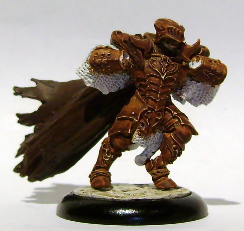 To do: clean up the graveyard earth, and highlight up to blazing orange, then bubonic brown, to brighty spots of bad moon yellow. Shade with black, and possibly a red wash. |
|
|
|
Post by roguetrader on May 6, 2007 21:48:57 GMT
its looking good colour wise so far, i like it ;D
|
|