|
|
Post by redcorsairs on Jan 26, 2008 10:13:55 GMT
I thought I should put up my WIP thread for my Dunland Army here so that you guys can see what i've been up to with my painting. Here the warriors are so far, I have been away for a week and been painting for a little bit. Two are done so far... 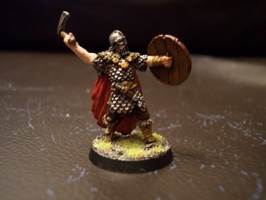 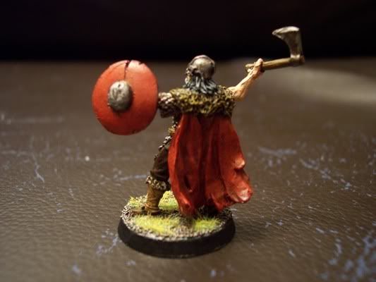 and... 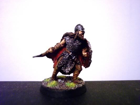 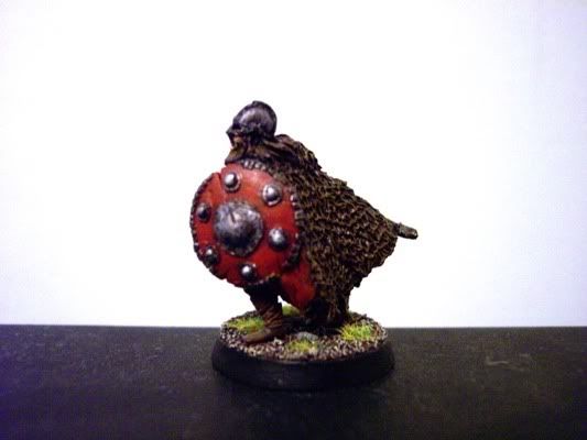 Comments/criticism welcome as always, I hope to do some painting today and some tommorow, more coming soon hopefully Thanks, Jake |
|
|
|
Post by razhburz on Jan 26, 2008 10:21:57 GMT
looks very nice mate. looking forward to follow this WIP  |
|
|
|
Post by Tim C on Jan 26, 2008 17:48:04 GMT
Nice looking WIP you have started, not alot to offer critique wise other than the usual add a couple more highlights here and there.
|
|
|
|
Post by zapoteke on Jan 26, 2008 22:32:46 GMT
they look great, I particulary like the 2nd minis shield colour - it looks ace!
|
|
|
|
Post by redcorsairs on Jan 28, 2008 5:28:54 GMT
Not been able to do much painting recently and probably won't do as much for the rest of the week either but I have done a little bit on the next warrior. Sorry bout the first pic here but there will be a better pic next time I update the thread with pics. The cloak  I have also chose to go for a darker skin tone on the rest of my Dunlendings as I prefer it on these minis. Heres an example, only done this arm at the moment 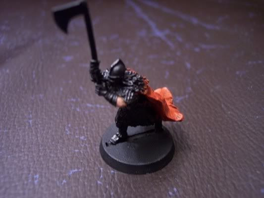 Thanks, Jake |
|
|
|
Post by razhburz on Jan 28, 2008 7:52:30 GMT
looks good from hat I can see, but as you say the pics are a bit blurry. Maybe you do this already, but you can rest the camera against a pile of books, or even better use a tripod. this makes it much easier to get some sharp photos of your minis  Cheers, Andre |
|
|
|
Post by redcorsairs on Jan 28, 2008 17:05:51 GMT
Thanks and thanks for the tip, trying to rest it carefully with two hands is quite challenging  . I'll keep that in mind for next time  |
|
|
|
Post by Tim C on Jan 28, 2008 18:13:30 GMT
Yep if you can afford one a tripod is the way to go, they are quite cheap actually. As for the mini looking good the more of these Dulendings I see the more I am convinced I should get some myself.
|
|
|
|
Post by rlangner on Jan 30, 2008 15:36:34 GMT
Never been much of a fan of LotR but these guys are looking quite nice. The bases are great too.
As for the camera issues. I tend to rest my camera on a desk or something similar when I take pics... You can always stack some books up and aim it down toward your mini if you want an angled shot, it'd probably add a bit more stability that way.
|
|
|
|
Post by redcorsairs on Feb 13, 2008 12:17:15 GMT
I thought I would share with you guys an easy and simple conversion for the bo'sun. (ps. these guys are what's been keeping me from my hellblade and dunlendings  ) I like it personally. Give the Corsair captain the crossbow. Cut off the tip of the boarding pike from the Bo'suns optional weapon. Then cut off the axe head for the Captains axe and file each of them so that they can fit onto each other. Glue together and you have these two heroes for your force: 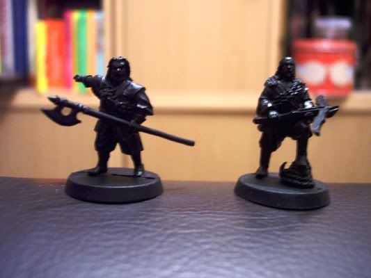 And heres one of them part painted to give you an idea of my colour scheme. They are the Red Corsairs  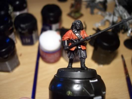 Comments/criticism welcome Thanks, Jake |
|
|
|
Post by razhburz on Feb 13, 2008 12:20:16 GMT
cool conversion! and very nice red on the corsair aswell!
|
|
|
|
Post by Tim C on Feb 13, 2008 12:21:11 GMT
Nice work so far mate, the conversions look good and I also like the pun. I am seriously thinking of adding some of these to my Lotr collection. Looking forward to seeing further updates.
|
|
|
|
Post by redcorsairs on Feb 23, 2008 12:15:06 GMT
Ok, you might have expected me to do some Red Corsairs but after testing with different ways of doing a Red colour scheme I decided not to do Red Corsairs and stuck to the GW scheme. I have also finished the Captain and Bo'sun (one of them might be in the Harad Painting Competition). I was happy with them myself but i'll see what you guys think;) 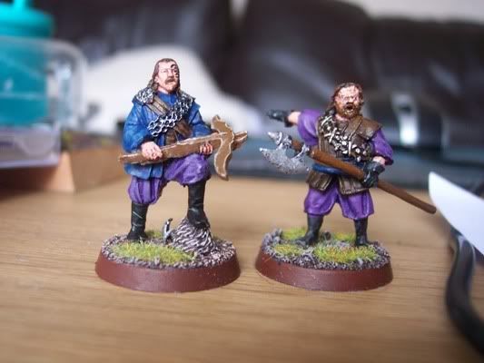 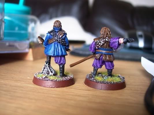 Comments/criticism welcome;) Thanks, Jake |
|
|
|
Post by Tim C on Feb 23, 2008 12:26:31 GMT
Yes they look pretty good, I thing the clothing could stand another highlight on both the blue and the purple areas but apart from that nice work.
|
|
|
|
Post by redcorsairs on Feb 23, 2008 12:31:44 GMT
Thanks Tim! I was thinking of doing a highlight of Warlock purple on the purple cloth, or would that be a little bright?
|
|
|
|
Post by Tim C on Feb 23, 2008 12:58:59 GMT
you could try just mixing in a little of the Warlock purple into your base colour but not too much as you want the transition to be a smooth one, alternatively you could add a touch of bleached bone or kommando khaki to your base colour that might work.
|
|
|
|
Post by redcorsairs on Feb 23, 2008 13:10:52 GMT
Ok, thanks for the tip  . I'll try that sometime soon. |
|
|
|
Post by redcorsairs on Mar 25, 2008 18:53:44 GMT
Hi guys, after about a month of no painting, I'm back! I decided to make a diorama using my Gimli on Dead Uruk-Hai which I recently finally decided to open after hearing the news of it being re-released>  . Anyway, after some thought I decided what I would do and how and got down to business. I am still working on adding extras to the base but they aren't done yet and when they are i'll post it up here. Here is the product so far: 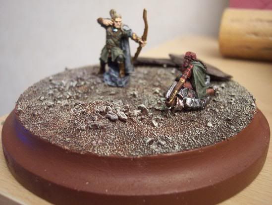 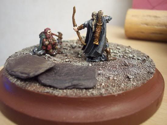 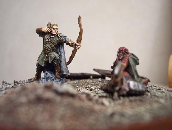 C/C welcome as always! Thanks, Jake |
|
|
|
Post by Tim C on Mar 25, 2008 19:05:12 GMT
It looks good, the only thing I would say is that the base is quite large and devoid of detail a few dead Uruks laying around would certainly help that. Ebob used to make dead uruks if you can still get them from anywhere now.
|
|
|
|
Post by redcorsairs on Mar 25, 2008 19:10:44 GMT
Thanks Tim, one of the extra details being added to the base is a dead uruk-hai and theres some weapons. Those dead uruks from ebob sound cool, dunno where I'd find them though, ebob doesn't seem to sell them anymore  Thanks! |
|
|
|
Post by Tim C on Mar 25, 2008 21:46:47 GMT
I'll have a dig about and see if I have any.
|
|
|
|
Post by redcorsairs on Mar 26, 2008 3:03:32 GMT
Noah, I'm ok thanks  . You've helped me out enough, and anyway, I found a way to get a dead uruk on the base. Thank you very much for the offer but I'm ok thanks  . Here is the final (i hope) piece. 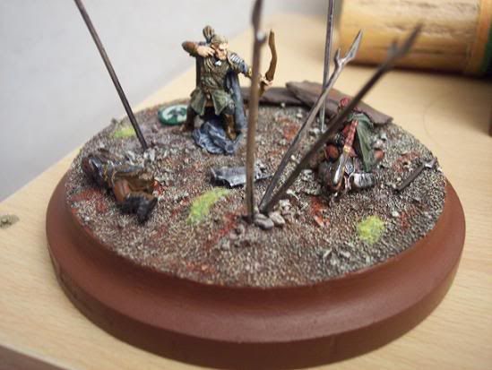 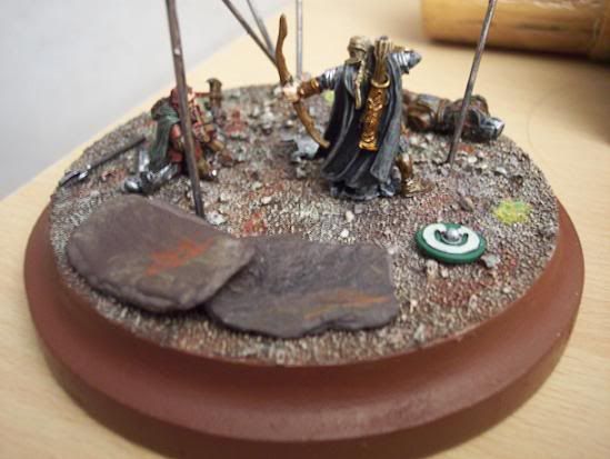 Thanks, Jake |
|
|
|
Post by Tim C on Mar 26, 2008 7:29:50 GMT
Now that looks alot better.
|
|
|
|
Post by razhburz on Apr 8, 2008 7:21:19 GMT
looking good mate!
|
|
|
|
Post by bruenor on Apr 8, 2008 7:54:46 GMT
Yep certainly an improvement on the large bland base.
Def' looks like they are in a battle ground.
|
|