|
|
Post by razhburz on Feb 28, 2007 10:42:34 GMT
thanks mate  __________________________ Jnr Wrote: i'm just a bit concerned i see a lot of texture in your finish, are you thinning the metals enough or is it the age old cant get a decent pic problem! ________________________ hmm I think its is a mix of both.  I need to think about that. thanks for telling me Dennis. Thanks, André |
|
|
|
Post by razhburz on Feb 28, 2007 16:21:00 GMT
here is yet another update. he looks a bit better IRL. its very hard to get the pics right.  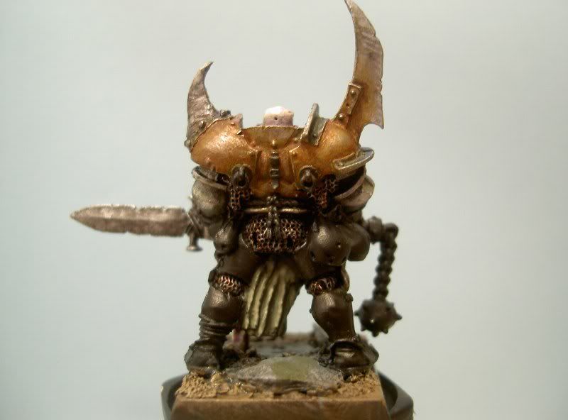 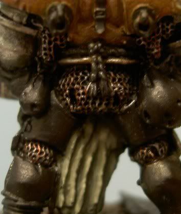 I have painted the clothes in a sorta pale green, given the spear tip a few more black washes and painted the chanmail. What do you guys think about the chainmail? I'm not too sure about it. I have aso washed the back with some red. Well, thanks for looking  //André |
|
|
|
Post by Tim C on Feb 28, 2007 16:56:35 GMT
I think this is coming out very nicely indeed Andre, the more it is painted the more Nurgly you are making it look.
|
|
|
|
Post by razhburz on Feb 28, 2007 17:15:15 GMT
Thanks mate  You don't think it is starting to look messy? next thing I'll do is to repaint the thing (what would you call that?) I added on the shoulder. Thanks again, André  |
|
|
|
Post by jabberwocky on Mar 4, 2007 4:04:01 GMT
I am liking the chainmail. I think you might go back and selectively do some very gentle highlighting to make it "pop" a bit more. The armor is looking good too, but I would recommend a couple of things. First, take some thinned black and outline the bolts--they are getting lost in the rust I think. Secondly, to also accentuate them better, hit 'em with some silver to make them pop out a bit. As far as it looking messy, I don't think it looks bad at all--you have to remember (particularly with the latest pics) this fella is blown up to 4 or 5 times his real size. This is good for picking out details and allowing us to give you a good critique, but it will also show every, single, little bitty flaw. Cut down the size a bit to get a better idea how it looks to the naked eye and then post that. I tend to like the bigger pics for the WIP's, but definitely get it closer to real life size for the final shot.
That being said, as I look at the face, the darklining on the face (really just the nasolabial fold) is a bit thick and there looks to be an errant brownish brushmark on the forehead below the nurgle symbol on the forehead.
|
|
|
|
Post by Tim C on Mar 4, 2007 8:09:03 GMT
That is excellent critique Jabber, thanks for that post Andre take note.
|
|
|
|
Post by razhburz on Mar 4, 2007 8:13:03 GMT
Thanks matey  I'll follow your advice  just a small question, which part do is the bolts (sorry for this stupid questionb ut wnglish is not my first language  ) EDIT: I have printed out your post jabber so I don't miss anything  |
|
|
|
Post by razhburz on Mar 4, 2007 16:55:34 GMT
is it these things that are called bolts? 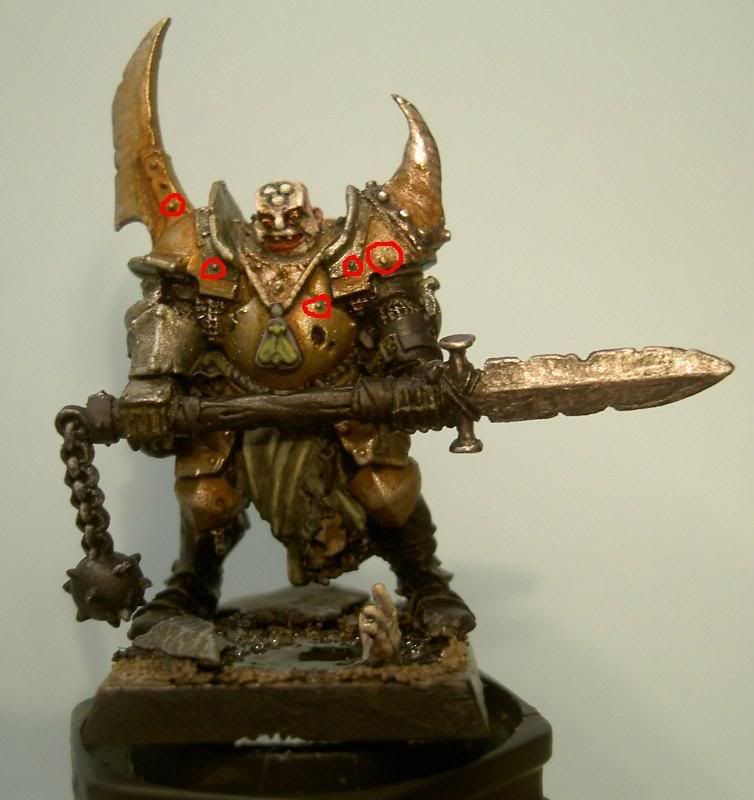 |
|
|
|
Post by jabberwocky on Mar 4, 2007 17:17:36 GMT
Right, Razh. That was what I was refering to.
|
|
|
|
Post by mousekiller on Mar 4, 2007 19:58:12 GMT
Jabber, you are always spot on with your recommendations. Razh, I would also recommend a bit of a brown, or rust, wash for the spear tip. Looks a little bit too clean right now for it to be nurgle..
|
|
|
|
Post by razhburz on Mar 4, 2007 20:27:09 GMT
Thanks mateys  I wanted to get some contrast from the brown thats why the spear tip is painted like that. I agree it does not look very nurgleish, but do you think there would be another way to do than brown? Thanks again  |
|
|
|
Post by mousekiller on Mar 4, 2007 21:03:41 GMT
Reddish brown or maybe some oranges...
|
|
|
|
Post by razhburz on Mar 5, 2007 13:38:22 GMT
thanks mate  ____________ When I read Dennis different contest ideas (in the comeptition forum) my eye was caught on the duel one, and I rememberd an idea I got some months ago. I ´have decided to go for it and enter it in the Open cat in the fang. here is the start  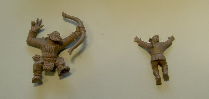 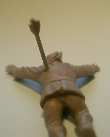 the idea is that I will have these two chaps. the peasent trying to run away and the orc kills him with a shoot from his bow. I might include a squig some where too  I know it might sounds a bit dull, but when I have come a bit futher it might even look cool  Thanks for looking  André |
|
|
|
Post by mousekiller on Mar 5, 2007 14:57:43 GMT
That looks like it is going to be a lot of fun. Any ideas on the base yet.
|
|
|
|
Post by razhburz on Mar 6, 2007 10:10:01 GMT
Thanks mate  I don't know what to base it on. but I have some ideas on how the base will look like, some fences a large rock (wich the orc will be standing on) some smaller rocks and bushes and similar things...oh, yes, A tree too (possible with some snotlings in the branches  ) _________________ here is a update on the nurgle chapion: I have followed your advice and here is what he look like now (man, its hard to get good pics though  ). 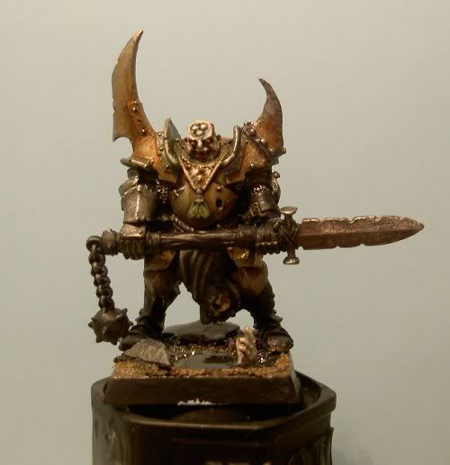 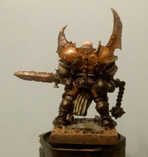 as you can see i have also painted some leather armour on his legs  Thanks for looking, André  |
|
|
|
Post by razhburz on Mar 6, 2007 14:34:07 GMT
while I have continued painting I have meet a small problem. I can't decide in what colour to paint the bags in (n the red "circles"). do you have any tips or ideas? 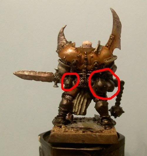 Thanks  |
|
|
|
Post by Tim C on Mar 6, 2007 15:08:54 GMT
Mmm not sure on that mate, I would have said darkish browns but that would make them blend into the rest of the model, you could go for dirty reds a Scab Red kind of colour what you don't want is anything bright.
|
|
|
|
Post by razhburz on Mar 6, 2007 16:09:09 GMT
hmmm red that might work. thanks mate  here is also an update. the things I have fixed since last update are: the head hanging under the spear. the rope aroundis waist. given the spear tip some dark brown washes. Painted some straps and more leather armour. some metal leg armour painted the handle of the spear and maybe something more which I don't remember atm. 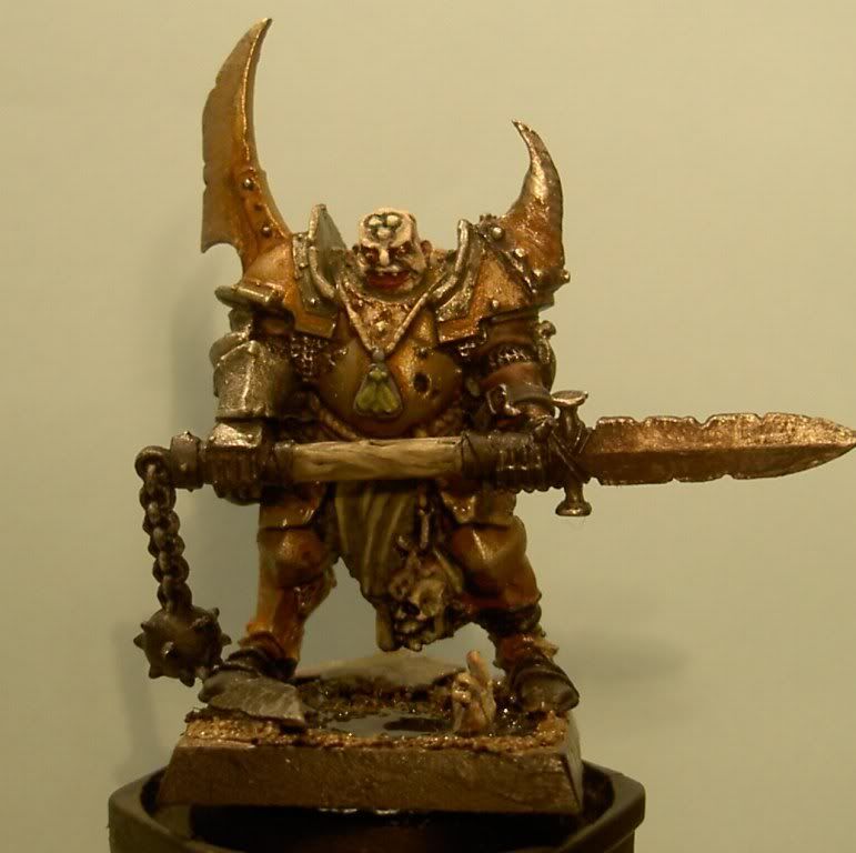 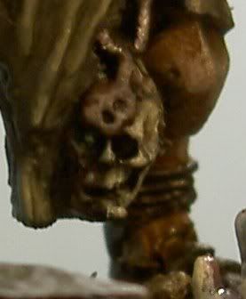 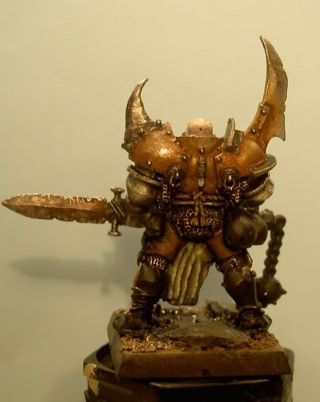 Thanks fo looking  André EDIT: P.S. tomorrow I'll try to get some pics outside. my light inside is not very good  |
|
|
|
Post by menace on Mar 6, 2007 18:16:36 GMT
gruesome! and suitably so... maybe for the bags you could go for some kind of raw leather look with old blood stains saturating the bottom, like he has some 'trophies' in there  |
|
|
|
Post by jabberwocky on Mar 7, 2007 9:19:05 GMT
Nice job on the bolts--perfectly done. Hmm...the bags...I might go for something a bit lighter just to break things up a bit. There is a lot of brown on his backside between the leather leggings and the armor. Perhaps a dirty gray? I think Dennis's suggestion on the blood stains is great. Keeps in style with the mini and also adds a touch of red for contrast.
|
|
|
|
Post by razhburz on Mar 7, 2007 9:31:07 GMT
Thanks guys  you got me something to think about. I really like the strained blood idea. dirty greymight be a good contrast too. any ideas onhow to achive a dirty grey? Thanks  |
|
|
|
Post by menace on Mar 7, 2007 11:00:12 GMT
Thanks guys  you got me something to think about. I really like the strained blood idea. dirty greymight be a good contrast too. any ideas onhow to achive a dirty grey? Thanks  add a little scorched brown to codex grey and add mix fortress grey to highlight  then build up the blood washes maybe as how Tim does swords with blood red and chaos black ???worth a try! |
|
|
|
Post by razhburz on Mar 7, 2007 11:04:58 GMT
|
|
|
|
Post by razhburz on Mar 7, 2007 11:07:10 GMT
Thanks guys  you got me something to think about. I really like the strained blood idea. dirty greymight be a good contrast too. any ideas onhow to achive a dirty grey? Thanks  add a little scorched brown to codex grey and add mix fortress grey to highlight  then build up the blood washes maybe as how Tim does swords with blood red and chaos black ???worth a try! ahh we were posting at the same time! I almost missed this. thaks for the tip buddy  |
|
|
|
Post by razhburz on Mar 7, 2007 13:12:27 GMT
guess what... its another update! painted the bags, what do you think? I'll have to go over the small ones again. 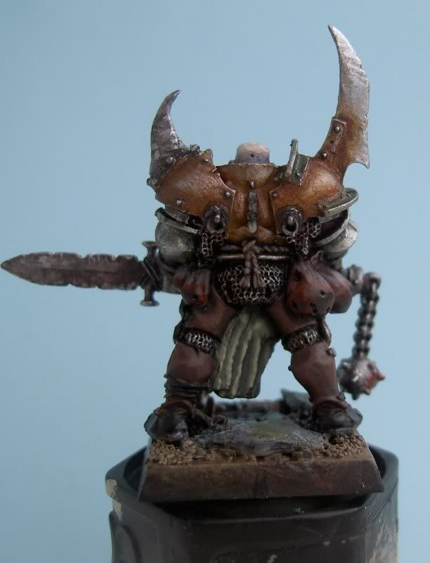 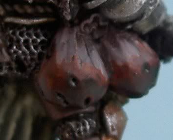 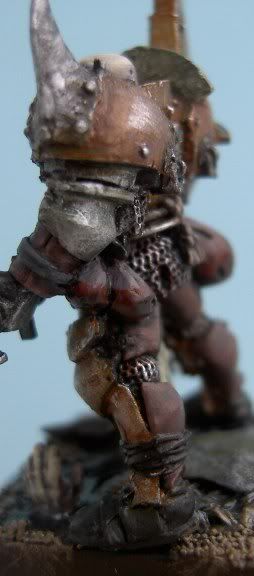 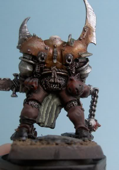 Thanks for looking  André |
|