|
|
Post by wolffang on Feb 27, 2007 16:18:08 GMT
Hi, my first post on this forum (besides the introduction). This is a model I'm painting for a local painting compo. I have no hope whatsoever of winning, but thought I'd enter just for fun. The theme is large model, so the choice for this fig was pretty simple, since I had him lying around.  He's my first large scale fig and I love painting him. 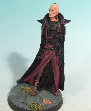  I'm trying to get a realistic colour scheme and am quite pleased with how the red leather turned out. The metal is also an experiment and hasn't turned out how I wanted. Maybe I'll redo it later. Skin needs some more shading. The boots are finished.  Comments and criticism would be much appreciated.  Cheers, Wolf Fang |
|
|
|
Post by Tim C on Feb 27, 2007 16:34:41 GMT
Ok firstly let me say that if you go into a contest with the negative thought of having no hope then you are already onto a loser from the start. Be positive anything can happen and you never know.
The Eldar ranger is indeed a very nice mini (I still have mine to paint) the red so far looks good but I would suggest going a little further with it, in contests you need eye candy by that I mean that you need to draw a judges eye away from your competitors.
The skin looks good but again could do with a highlight or two more and possibly a little darker shading in the more shadowy areas, I find the best way to do this is with very thin glazes, a tiny amount of paint to a few drops of water and mix it well then apply in a lot of layers being careful to let each layer dry, you also need to keep an eye on this as as it dries you can get a tide mark but if you catch that whilst still wet you can usually brush it out with a clean damp brush.
I agree the metal does not look as good as the other areas you have completed so maybe a rethink there.
At the end of the day though remember that as long as you are happy with the finished piece then that is really all that matters.
|
|
|
|
Post by wolffang on Feb 27, 2007 16:40:25 GMT
Thanks for the advice. I agree the red needs something that makes it pop out, so I'm going to add some freehand once I finish the rest of the mini. (which will be a first.) I'll highlight the metal a bit further and see how that works out. If it's still crap, I'll redo it. As you said, the face does need some more shading, so I'll try your advice with the glazes.  Cheers, Wolf Fang |
|
|
|
Post by razhburz on Feb 27, 2007 19:57:25 GMT
This is a quite cool mini. and I think you are doing a great job on him mate  I agree with what Tim has said. I also think that the boots look great.they are very nicely done  Cheers, Razh |
|
|
|
Post by mousekiller on Feb 27, 2007 21:27:22 GMT
In addition to Tim's advice, don't be afraid to overhighlight him. On such a large piece you have a few more liberty's. And, if he appears too bright you can always go back in with those glazes to tone him down.
|
|
|
|
Post by menace on Feb 28, 2007 9:18:10 GMT
I'm working on the same mini as i write! i can't really give you any better advice than what you've got but if this is a comp and you've never done freehand before i would suggest leave it out and go for the UberHighlights instead!
|
|
|
|
Post by wolffang on Feb 28, 2007 11:49:44 GMT
Thing is that I don't want the red to be to bright, so I'm working with Dwarf Flesh, to brighten up the Red Gore, instead of Orange. So I can only highlight to a certain extent before it turn to pink. But I'll see how far I can go.  Thanks for the comments so far guys.  Cheers, Wolf Fang |
|
|
|
Post by menace on Feb 28, 2007 12:14:01 GMT
Thing is that I don't want the red to be to bright, so I'm working with Dwarf Flesh, to brighten up the Red Gore, instead of Orange. So I can only highlight to a certain extent before it turn to pink. But I'll see how far I can go.  Thanks for the comments so far guys.  Cheers, Wolf Fang You can always highlight too far with dwarf flesh/elf flesh and then work it back with red gore glazes, this way gives you a very vibrant red highlight |
|
|
|
Post by wolffang on Feb 28, 2007 12:17:08 GMT
Hmmm, I'll try that.  Thanks It's been glazed with purple ink so far, but some more Red wouldn't hurt I suppose.  Cheers, Wolf Fang |
|
|
|
Post by jabberwocky on Mar 4, 2007 3:52:04 GMT
Great looking start, Wolfie! I would echo what the others have said...I am a bit late to critique, so at this point don't have anything else to offer. I'll try and pay closer attention so everyone doesn't beat me to the punch  . |
|
|
|
Post by wolffang on Mar 21, 2007 16:00:27 GMT
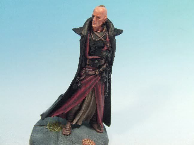 Update: Finally had some time to continue the work on this guy. (School and St. Patty's day were quite timeconsuming) After painting the loin cloth purple, I decided it looked like crap and repainted it Beige/Khaki, which IMHO looks much better. Glazed his face as you guys suggested and rehighlighted. It does look much better now, though the pic isn't very sharp around the head. Followed the rest of the advice and highlighted the inner cloak further and I'm now happy with it. I painted the leather straps on his breastplate and belt, as well as the breastplate itself. (it's black and the highlights don't really show on the pic. The straps turned out quite well IMO. Comments would be greatly appreciated.  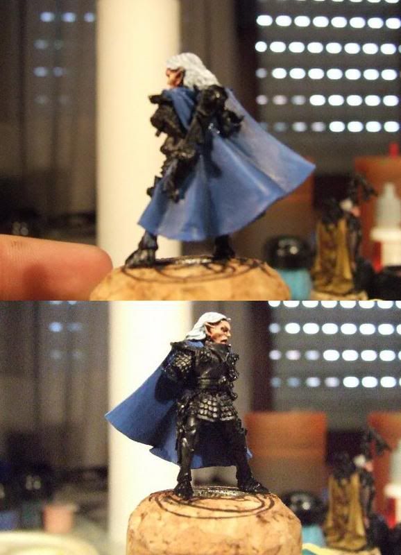 Made a start on Selafyn as well. Quite pleased with him so far. The cloak needs some more glazes though to smoothen the blends. Cheers, Wolf Fang PS: Sorry for the crappy pics. |
|
|
|
Post by razhburz on Mar 21, 2007 16:08:56 GMT
looking very nice mate  as i have said before I really like the red. I think you did a good choice to change the purple to khaki. the straps look very well done too  as you said, the highlights on the breast plate, are hard to see in th photo, but maybe you should highlight it a bit more on the very edges? the face is looking much better now  maybe just highlight one more time, on the tip of the nose etc? all in all, a very cool job so far  // André |
|
|
|
Post by wolffang on Mar 21, 2007 16:21:44 GMT
Yeah, I'll highlight his nose and eyebrows one more time. They still need a little more definition. I'll see about the breast plate. I really don't want to overhighlight the black. The purple was an experiment which turned out really bad.  Didn't even want to take pics of it.  Cheers, Wolf Fang |
|
|
|
Post by Tim C on Mar 21, 2007 17:30:50 GMT
Both models are looking nice at this stage, the red on the ranger is excellent mate.
|
|
|
|
Post by mutantpotato on Mar 21, 2007 21:40:19 GMT
Both minis are looking good. The reds and beiges/browns at the ranger looks really good. Good luck in the competition ;D
|
|
|
|
Post by jabberwocky on Mar 22, 2007 2:02:05 GMT
Very nice work on the ranger! I like the straps very much. As the others have mentioned, the reds are looking very good at this point. I like the brown loincloth. I have an extremely little nitpick here, but since this is a comp entry, I thought I would mention it. On the belt to the right (mini's right) of the buckle the highlighted area of the belt looks just a touch to thick to me. Again, this is very, very minor and feel free to ignore it; it was the only other thing I could find that the others had not mentioned.
|
|
|
|
Post by wolffang on Apr 2, 2007 11:11:10 GMT
New mini after finally having finished the Ranger:  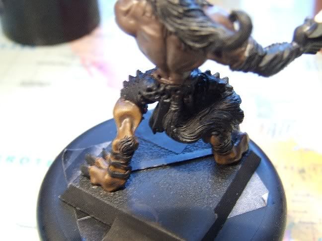 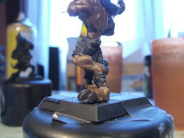 I started the first of my Wolfen minis (Kassar the Fugitive) to find a skin colour I like and I think this one should work well. Comments and crits appreciated.  Cheers, Wolf BTW: I just noticed that I accidentally put Asgarh's legs under Kassar's torso.  Meh, they both work fine, so I'll leave him like that. |
|
|
|
Post by Tim C on Apr 2, 2007 11:25:57 GMT
Promising start. I did a brown on my Varghar model which worked quite well I look forward to seeing your Wolfen progress mate.
|
|
|
|
Post by razhburz on Apr 2, 2007 13:08:25 GMT
So far so good  looking forward to see the progress  |
|
|
|
Post by jabberwocky on Apr 2, 2007 15:50:56 GMT
Very good start!
|
|
|
|
Post by mousekiller on Apr 9, 2007 22:02:33 GMT
Great start. What are you planning for the base?
|
|
|
|
Post by racssirt on Apr 10, 2007 6:32:29 GMT
A good start mate, which should hopefully lead to a good end result! Keep going!
|
|
|
|
Post by wolffang on Apr 13, 2007 17:04:43 GMT
Thanks for the replies so far guys. Don't know what I'll do to the base yet. I've been thinking about experimenting with slate for a while now, so maybe I'll give that a go.  Cheers, Wolf |
|
|
|
Post by mutantpotato on Apr 30, 2007 13:45:18 GMT
I think the skin look great. You have highlighted it without going too far, and the transitions look smooth. Great job so far  |
|
|
|
Post by wolffang on Apr 30, 2007 18:00:55 GMT
Thanks mate. There's a bit more contrast IRl though, but like I said, the pictures are crap.  Cheers, Wolf Fang |
|