|
|
Post by stinkyskink on Jul 31, 2007 11:05:01 GMT
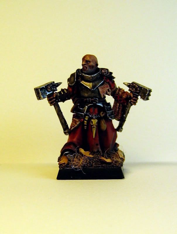
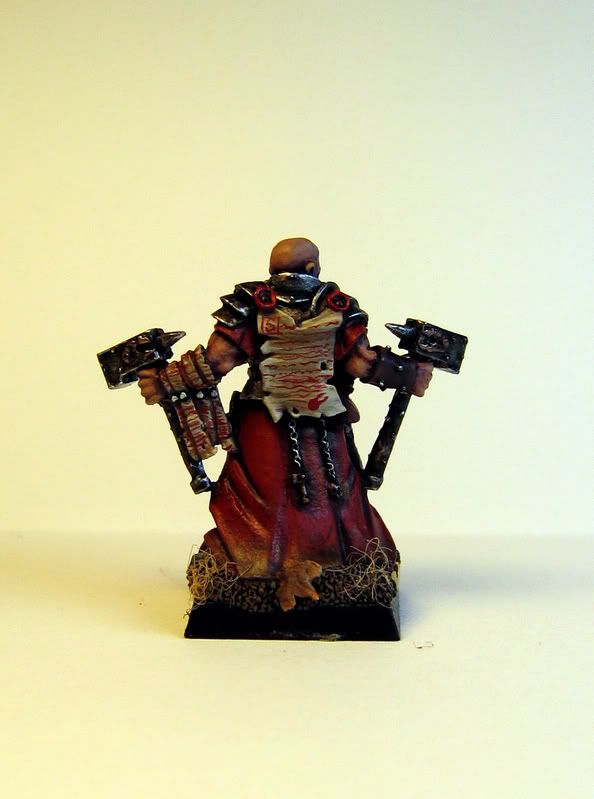
I have been assembling miniatures the last weeks, so now I just had to paint something. I had this warrior priest standing on my desk, so he got some paint:) I had a go with tallarn flesh for the first time, I have to say it looks much more realistic than dwarfflesh. I allso tried out tamia smoke. I've had the pot for over a year, but never got around to try it. I was very sceptical in the beginnig. But a few watered down layers did wonders.    Please let me know what you think I could improve or do do different  |
|
|
|
Post by Tim C on Jul 31, 2007 11:23:37 GMT
Very nice, this is the best of the Warrior Priest models released and you have given it a dark look which really suits it. The only thing I see that I think could be better is the writing on the parchment on the back and hanging from the purity seals. I think red is the wrong colour for that myself and would have used black or a dark blue to make it look more like ink.
|
|
|
|
Post by mutantpotato on Jul 31, 2007 12:15:55 GMT
Wow I really like your style, so dirty and gritty ;D I really like the flesh, and the metal areas. I agree with Tim, that maybe the writing should be in black, if it's not written in blood  |
|
|
|
Post by menace on Aug 3, 2007 0:32:00 GMT
Kul... thank god someones painted one of these guys like he's had a bit of a fight, most i've seen have come from some sunday service in their regal best! The red freehand is a bit too scrappy and not a great choice given the red already used... for writing I tried a little thing i like, after painting the backgroun I varnished it and once dry painted straight fine lines with dilute black, then once that had dried i scraped it really gently with a sharp point to look like text...see my lexmechanic for an idea of the effect  |
|
|
|
Post by racssirt on Aug 3, 2007 8:07:54 GMT
Looks brill mate, as the others have said, it really looks like he's been in a bit of a tussle and got a bit dirty!
Your style is great but the writing would look better in a more inky colour, but then again, it could have been written in blood as MP said. I suppose it depends how evil you really want him to be!
|
|
|
|
Post by roguetrader on Aug 4, 2007 9:56:09 GMT
looks cool, i love the armour, i quite like the red ink but think black/blue would have been better given that he has red robes. Great job
|
|