|
|
Post by jabberwocky on Oct 9, 2006 15:44:46 GMT
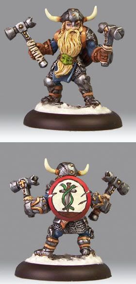
Here is my entry into the single fantasy category here at WoM. Suggestions on the shield in particular would be greatly appreciated. I wasn't sure how to highlight/shade it. I have seen plenty of pictures of the shield highlighted very nicely with NMM, but I wasn't sure how to do it with the way I painted it.  |
|
|
|
Post by jabberwocky on Oct 18, 2006 14:42:16 GMT
Any suggestions on improving him, anyone?
|
|
|
|
Post by Tim C on Oct 18, 2006 15:12:49 GMT
I think the overall paintwork is very good and there is not alot to do realy to make him better, the shield for me though painted well doesn't fit the mini (not very Dwarvish if you know what you mean).
It is not the fact that you have put the shield there it is more the design and the colouring, I would go back on the shield and start again.
I would possibly use a Dwarf rune and do the shield in different metalic looking effects.
|
|
|
|
Post by dansemacabre on Oct 18, 2006 15:17:24 GMT
I agree with Tim about the shield, the rest is ok for me.
Just a note on the mini itself: seems to me that this dwarf is a little too slim, do you agree?
|
|
|
|
Post by jabberwocky on Oct 18, 2006 15:36:33 GMT
Hehe, now that you mention it, he does seem a bit thin...the shield design itself was requested by the recipient of the mini. I am not sure of the symbolism of it, but that was what his D and D dwarf had, so that is the way I painted it. I agree, it is not really very "dwarven" appearing.
|
|
|
|
Post by dansemacabre on Oct 18, 2006 16:30:59 GMT
lol perhaps he was closed on a dungeon without food for a long time  |
|
|
|
Post by racssirt on Oct 18, 2006 19:32:57 GMT
I like this! (In fact, this was somewhere in my compeition voting post - good luck!) An awesome mini with a great paintjob!  |
|
|
|
Post by jabberwocky on Oct 27, 2006 11:28:36 GMT
After soliciting some advice around the net, I made a few changes to the shield. I like the result. Critiques?  |
|
|
|
Post by Tim C on Oct 27, 2006 12:04:52 GMT
Looks better, I was going to offer a little advice and then forgot to do it so my apologies there, what I was going to say was to treat the shield in two halves, but that I mean that one half of the sheild would be going darker towards the bottom and the top half going progressively lighter this I think would be the effect of the light hitting and reflecting off the shield.
But the updated version shows that you have done a little of that and it does look much better.
|
|
|
|
Post by racssirt on Oct 27, 2006 17:08:41 GMT
I really like the chips in the shield! Excellent work mate!  |
|
|
|
Post by menace on Oct 30, 2006 19:52:45 GMT
Looking much better... maybe the white needs a bit more shadow towards the bottom of the shield... may be the pic though  |
|