|
|
Post by doctordoom on Jan 27, 2008 3:24:52 GMT
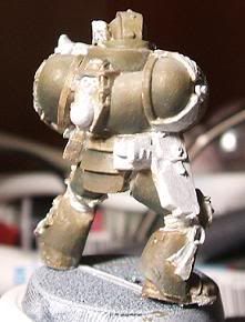
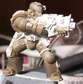
I split a box of Space Marine Veterans with a friend, so I have a couple of these guys now. Started on the first today.   It's all a bit messy at the moment. But I'm pretty happy with the colour (maybe a bit more green in it) and the shading. I'll still need to shade some more, but it's coming along. I'm happy to hear any opinions on it. |
|
|
|
Post by Tim C on Jan 27, 2008 9:34:11 GMT
It is a bit too early to give any real opinions but the colour is good, I do agree you need shade more. Keep us updated so we can see it progress.
|
|
|
|
Post by zapoteke on Jan 27, 2008 11:29:33 GMT
looks good, I really like the pose - darn cool!
|
|
|
|
Post by reddogfive on Jan 27, 2008 14:24:27 GMT
Need to see more!
Keep those pics coming!
ArrOOoo!
|
|
|
|
Post by redcorsairs on Jan 28, 2008 5:28:27 GMT
As said, love the pose and looks cool at the moment. Keep us updated  |
|
|
|
Post by doctordoom on Jan 28, 2008 21:02:14 GMT
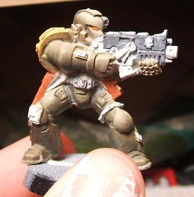
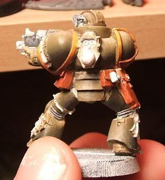
Thanks for the replies guys. I can't take credit for the pose (although it is cool!), the model comes like that. Here are some pictures of where he's at now.   The shins don't look done to me, so I'll do a bit more work on them. I still have to line some points where armour meets (a real pain!), and then I'm on to the smaller things. I'm wondering about all the lenses on him (he's got two, plus eyes). I was thinking of a yellow/orange colour, but I'm starting to lean towards red/purple. Any opinions on that? |
|
|
|
Post by zapoteke on Jan 28, 2008 22:18:49 GMT
with the colours so far I would go for red/purple, bit more contrast than yellow/orange. and that's good.
|
|
|
|
Post by Tim C on Jan 29, 2008 6:14:55 GMT
Coming along nicely, I agree that lining SM's is a pain. I also think that red/purple would be a good colour choice for the lenses, blue would also work too.
|
|
|
|
Post by bruenor on Jan 29, 2008 8:46:45 GMT
Looking good!!
Is it a selfmade chapter scheme?
|
|
|
|
Post by razhburz on Jan 29, 2008 10:20:36 GMT
looking good  I also think red or purple would look better than orange  |
|
|
|
Post by rlangner on Jan 30, 2008 15:33:43 GMT
Looks nice so far... The armor looked kinda flat in the first few pics (they appeared washed out by flash or something...) but the last one has a good amount of depth to it... I trust that one is a bit more accurate? I'd agree with the others in suggesting red (probably a dark red) or purple for the lenses. I don't really know what else to say. Looking forward to seeing more.
|
|