|
|
Post by kingulrikflamebear on Aug 14, 2007 20:59:35 GMT
I have seen this used to good effect, and thus I have stolen it. =P This is somewhere that you'll get chance to see all my stages as I paint whatever I paint over the next XXXXX weeks/months/years. I have a large backlog of mini's as many of you might remember, and thus I am working through them - without trying to buy too many (failing at this). I will not, however list them here, but rather show you what I have (minus new stuff)      I have added more stuff since then, but it's not too much. Anyway, this is my work pile I'm working through. I aim to improve my abilities and to cut back on the number of unpainted minis I possess. So, as I get through them, any work in progress shots will be in this thread with a nice separate thread for the final and finished product at the end. Watch me as I work! KU |
|
|
|
Post by kingulrikflamebear on Aug 14, 2007 20:59:53 GMT
OK, the first WIP entry is my current miniature of the Games Workshop Wraith for Vampire Counts. I had this because years ago I aspired to start a Vampire Counts army, never got much further than buying some stuff. Anyway; Wanting to do something a little different and expand my abilities, I have decided for this mini I will do directional lighting. Basically everything is lit from a specific angle (here from behind), but with this I wanted to go one step further. You may not know but the 'evil' moon in Fantasy is green, so I decided I am going to try and highlight using green to give the 'spooky' look. In addition to this I will be attempting to do a nice set of orange glowy eyes on the wraith and some rust on his scythe. Two more things I've never done. Picture one: 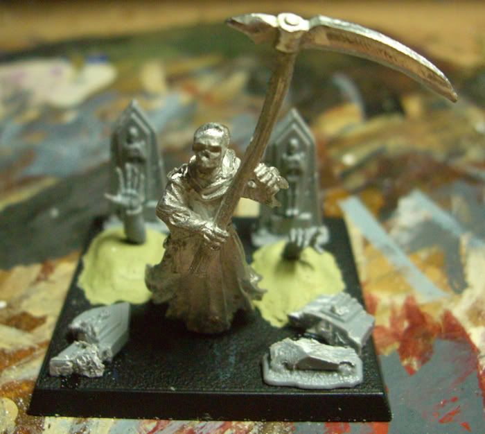 This is a mock up of his base. Wanting him to be a little bit more suiting, a graveyard seemed appropriate, thus a bit of rummaging and I came up with some zombie arms and some gravestones. Hacking two up I wanted a broken down look and above is the end product. Picture two: 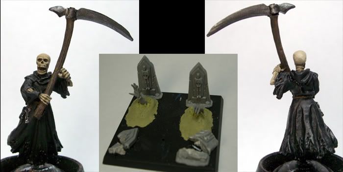 The wraith thus far. You'll notice the general lack of highlights on much of him, this is because only his skull is done. The difference is very hard to see =( but about half way over the top his skull gets more highlights, due to the idea of the front not getting any light to it and I'm trying to keep it dark. Otherwise, I have just shaded the staff and the blade on the weapon. Not much to him so far, but soon!! KU |
|
|
|
Post by mutantpotato on Aug 14, 2007 22:58:49 GMT
A nice little diorama there. You gotta love those hands coming out of the graves! Nice work so far, looking forward to see it progress  |
|
|
|
Post by razhburz on Aug 15, 2007 5:30:14 GMT
yeah it looks ace so far mate. I think this is gonna be a really coll diorama in the end. it really have that spooky feeling  |
|
|
|
Post by Tim C on Aug 15, 2007 6:40:26 GMT
Nice start, the base is really going to set this off nicely.
|
|
|
|
Post by dogfacedboyuk1 on Aug 15, 2007 17:15:49 GMT
Great base, although I would make the graves longer and put the arms further down. Look forward to seeing this one painted up!!
|
|
|
|
Post by kingulrikflamebear on Aug 15, 2007 21:34:01 GMT
Thanks all. =)
I am hoping to do well on this, like I said I'll be trying out a few different things I've never done before. It'll be different I'll give you that much!
dogfacedboyuk1 - I did think that, but my that time the arms and milliputwere set hard, so I can't do it without ripping it all off. =( Maybe next time.
KU
|
|
|
|
Post by kingulrikflamebear on Aug 16, 2007 19:38:56 GMT
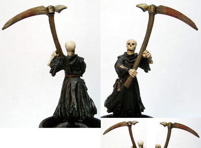 Well, I have progresses.. um.. very little. There is a reason for this, well one besides not getting out of bed until half twelve, and I had problems with the skull and blade. I decided to give the skull a wash to darken the front a little, then using a lighter colour I washed the bone in this to try and tie the large difference together. What happened was odd. The highlighted section (rear facing) went really, really white and chalky. Then I wash it again, the same. So after various attempts I went back and redid the front of the skull - this was because a shading wash made it look really dark brown and well... "not very good" to paraphrase. Looks OK now, but you can see a clear split in the 'halves' which I'm not fully happy on, but we'll see. Then the blade. I washed it with various layers of scorched brown and Tamiya Clear Orange to represent 'wear, tear, and ageing'. This was OK, but hard to see due to the basecoat being so dark (note, rusting etc seems to work best over a clean layer; chainmail or mithril silver perhaps). Then I got onto the blood. This was the problem. The first adding (Tamiya Clear Red) made it look like I had just painted a blocked strip across the blade. But on the reverse it came out OK. So, back to washing to try and do something with the 'block'. Failed, so I drybrushed mithril silver and started with the 'weathering' again. Hence why the two sides don't look exact.  The blood worked out OK, but I need to practice using it. The staff however went OK. Using VMC Burnt Umber and Flat Earth I got a nice dark looking staff. So, either with a few problems I don't think it's terrible; though the pictures don't show everything up all that well. Next stage: grey highlights on the front, then to start the green on the rear before trying my hands at glowing eyes. All comments welcome. KU |
|
|
|
Post by kingulrikflamebear on Aug 16, 2007 19:43:39 GMT
Incidentally I used this site here on Tuesday and for £30 I got all this:   And two cans of Testors Dull Cote as well. It came this morning. Now that is quick! This place has so much modelling stuff, for bases etc it cannot be passed up on! KU |
|
|
|
Post by greenstuffguy on Aug 16, 2007 21:48:47 GMT
Do you think that you would be willing to trade you death korps miniatures?
GSG
|
|
|
|
Post by kingulrikflamebear on Aug 21, 2007 19:35:19 GMT
OK, well I took a day or so off and I have been working a bit - and reading a lot. I am not fully convinced it has turned out quite how I wanted, but I'm not sure. It does give a sort of glowy look, though I'm not fully convinced about the back of the - skull, weapon blade and haft. Live and learn I suppose. Just the eyes left, then onto the base. =D 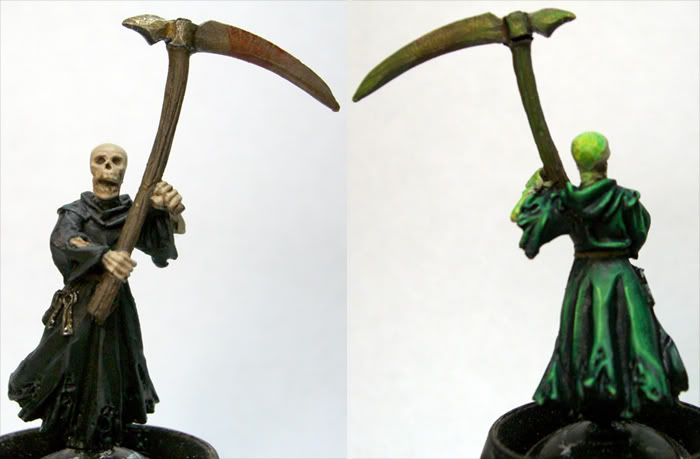 As you can see, the skull and weapon as I mentioned don't quite look right to me. I think perhaps if I had done more, thinner washes/glazes it might well have worked better. But it's not too bad. The cloak itself isn't too bad I think. What do you all say? |
|
|
|
Post by Tim C on Aug 21, 2007 21:00:53 GMT
The cloth part looks awesome but like you say the skull doesn't look quite right though not being an expert nor have I ever tried this technique I cannot say how to change it for the better.
|
|
|
|
Post by mousekiller on Aug 21, 2007 21:49:51 GMT
Maybe once you get the eyes done it will come off a bit better. Might just be the lack of any other color on the front of the skull that is making it look off.
|
|
|
|
Post by dogfacedboyuk1 on Aug 22, 2007 10:46:10 GMT
This is looking very promising apart from the front of the skull which needs some more work! Glow effect looks lovely and the weathering on the the blade is great although i think the staff handle needs more work. When I painted my skeletons years ago i think i painted a base coat of GW bubonic brown with a heavy wash of brown ink and bring back the bleached bone colour with dry brushing. This looked very effective for worn old skeletons (not a fan of the old pure white shiny guys!!!) maybe repaint the whole skull if the front is such a problem?
|
|
|
|
Post by mutantpotato on Aug 22, 2007 18:53:30 GMT
Looks good so far mate, and the green light is really cool.
I have some questions about the three leave packs you got. I have been thinking about ordering some. What quality are they, can you reccomend them?
|
|
|
|
Post by kingulrikflamebear on Aug 26, 2007 18:54:10 GMT
OK, well the eyes have been done. I sort of like them, but it will require practice to get this looking good at all really. =) 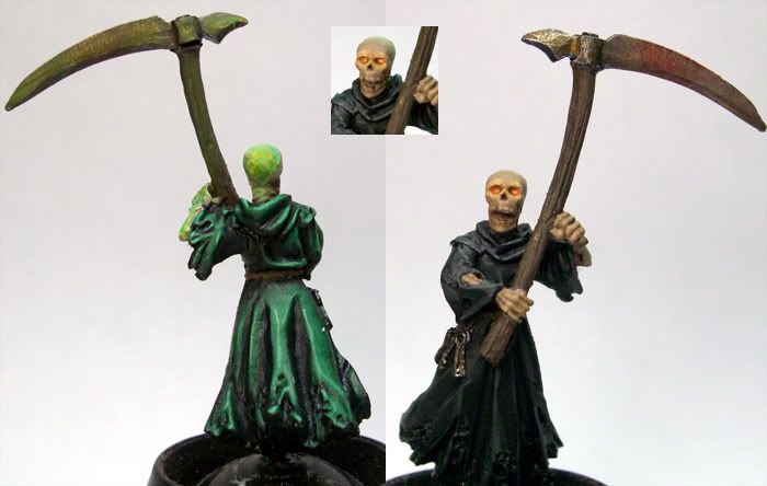 KU |
|
|
|
Post by razhburz on Aug 26, 2007 19:08:08 GMT
love the eyes mate  though I think the OSL above his eyes looks a bit strange, the light would not fall there. or maybe it is shining through the skull? is so it looks pretty kool  |
|
|
|
Post by woodspeed on Aug 28, 2007 7:31:49 GMT
looking realy good one small little nitpick the teeth (dunno if you have done anything with them yet but if so ignore me) maybe outline the teeth with a darker bone colour as they seem to blend with the rest of the skull
|
|
|
|
Post by kingulrikflamebear on Aug 28, 2007 20:47:17 GMT
Thanks!
André - I think you're right about the glow above his eyes.
Inquisitor - Yes, I noticed that now. Thanks, will see to it.
KU
|
|
|
|
Post by greenstuffguy on Aug 28, 2007 21:43:28 GMT
Nice work on the OSL, I think you need to define the boundary between the skull and the teeth with f.eks Diluted Scorcherd Brown. Also Check your PM's  GSG |
|
|
|
Post by roguetrader on Aug 29, 2007 9:12:07 GMT
looking good, no other crit to add to any anybody elses, nice work on the eye's, abit of practice and you will have it sorted  |
|
|
|
Post by kingulrikflamebear on Sept 9, 2007 13:52:22 GMT
OK, well been a while - due to work, other commitments etc - but he is now done. I have been working on the base, and here I was aiming to get a sort of aged look on the stones and following with the rest of the mini give it the green glow. I think it has sort of been pulled off, not too well but neither has it failed utterly. Anyway, here is a picture - not the best I'm afraid. Tell you the truth, until I added the wraith, I thought the base was ruined. Luckily, as it turns out, it works none too badly. =D 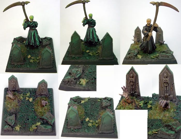 What have I learnt? Well, when doing OSL or any other form of directional lighting, you need to be consistent and know exactly where the light is coming from and where it will hit. Failure to do this could mean it goes all wrong. Oh and, I need more practice at this sort of thing. =D Incidentally, this will be the last mini I paint for a short while. Reason? I move to Sheffield university in about two weeks and the week before I move will be packing; leaving me with about two days of painting. Not worth starting anything then. So, when I get chance I will hopefully pick up my paint brush once more; until then I'm afraid they must be laid to rest. KU |
|
|
|
Post by razhburz on Sept 9, 2007 14:03:49 GMT
NICE! i really like the finished product. the grave stones are very nice  and the wraith is ace, I just think the handle of the scythe looks a bit flat, great otherwise!  Good luck with your university studies I hope you will get back to painting in a not to far future  |
|
|
|
Post by Tim C on Sept 9, 2007 17:50:35 GMT
That is very very nice mate, the green looks very ethereal.
|
|
|
|
Post by kingulrikflamebear on Sept 11, 2007 8:45:35 GMT
Thanks!
Tim - That is exactly what I was aiming for, to give it a different form of lighting and umm.. 'spooky'.
Andre - Perhaps, but I did do some work on it; just doesn't show well enough. =(
KU
|
|