|
|
Post by scarifice on Dec 29, 2006 12:46:57 GMT
without any words, here is my first GD entry for the German GD  pls comment, i need your comments to improve my painting skill and to made it till the finalcut. thats my goal |
|
|
|
Post by matty1001 on Dec 29, 2006 15:20:12 GMT
Well the pics a little grainy, but the red cloak is looking very smooth with great transitions. I would belend the white in more on the edges of the gold areas below his waist as they just look like they have been 'blobbed' on.
|
|
|
|
Post by jabberwocky on Dec 29, 2006 17:18:06 GMT
Good start, Scarifice. I would agree with Matty on the gold. The red looks good so far, but (and this may just be the picture) I feel it could use another highlight or two.
|
|
|
|
Post by Tim C on Dec 29, 2006 19:49:30 GMT
The red looks good and the gold looks awesome mate.
|
|
|
|
Post by racssirt on Dec 30, 2006 8:08:22 GMT
Looking awesome so far mate!  |
|
|
|
Post by scarifice on Dec 30, 2006 14:08:18 GMT
thx for all your comments!
i worked a littlebit on the gold, but i think it is still not perfect.
tonight i am going to paint again and show you some new pics tommorow or so.
|
|
|
|
Post by scarifice on Jan 2, 2007 14:04:24 GMT
sorry. but i was too drunken the last days to take a picture^^
maybe today or tommorow you will get new ones!
HAPPY NEW YEAR!
|
|
|
|
Post by dansemacabre on Jan 4, 2007 8:49:28 GMT
Happy new year to you too! I love the red, very smooth transitions plus i think the red with the gold nmm is one of the best palette combo around so keep on with the good work and no criticism for now  |
|
|
|
Post by orkydave on Jan 6, 2007 1:25:24 GMT
looking fantastic!
the eldar lend themselves really well to some freehand designs in the robes and such. touches like this seem to impress judges too.
|
|
|
|
Post by scarifice on Jan 28, 2007 22:47:15 GMT
after a long long time i found some time to paint! here are new pics of the eldar and my second GD entry.   P.S. sorry for the poor pics...its late here in germany^^ i promise tommorow or the day after tommorow you will see better ones |
|
|
|
Post by matty1001 on Jan 28, 2007 23:26:05 GMT
As before the blend look very smooth and well blended, the contrast between the colours is great, and your lighting source (from above? zenithal?) looks great and looks like its all falling in the right spots. Though some of the gold 'bars' could be highlighted along the tops to exaggerate this further.
Great work so far!
|
|
|
|
Post by mminiatures on Jan 29, 2007 4:18:42 GMT
Looks great--but where's his head gone?
|
|
|
|
Post by scarifice on Jan 29, 2007 6:26:55 GMT
that head....yes.....uhm.....well....
he fell from my table and than the head broke off........ -.-'
thanks for your comments
|
|
|
|
Post by menace on Jan 29, 2007 10:27:58 GMT
At this stage it is difficult to criticise, it all looks so good... a couple of necessary points... what GD?? if it's UK you will have to pull out all the stops for something beyond excellence!(just realised you have already said German GD!! feck, some top painters there) Once you have the overall theme then i think we can help you best to pull up all the points ..that spending to much time on a mini lends to the painter not seeing.... ...ps. you are improving so quickly i'm going to have to shed my shell or i won't have a chance at GDUK.. if all goes well i'm entering the WH40K squad  |
|
|
|
Post by dansemacabre on Jan 29, 2007 19:04:56 GMT
The picture don't helps to judge but i think it's good, as menace said better to wait the overall theme.
|
|
|
|
Post by racssirt on Feb 3, 2007 12:20:02 GMT
Lookin' ok there mate! I eagerly await some better pics! ;D
|
|
|
|
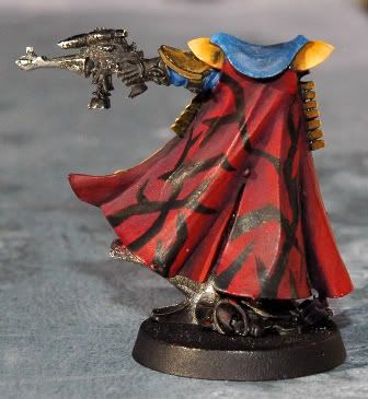
Post by scarifice on Mar 11, 2007 14:22:06 GMT
  i am still alive^^ i worked on my entry a little bit... after i nearly killed my self cause of the backside i decided to paint a small freehand on his back...and i also think the gold nmm is to flat now so i have to use some washes and than it should fit.. pls comment |
|
|
|
Post by Tim C on Mar 11, 2007 14:44:23 GMT
The Eldar is looking great, I am not sure about the freehand yet but it is a bit early to tell from this,
|
|
|
|
Post by mutantpotato on Mar 11, 2007 14:48:47 GMT
He is looking good. I don't know if it is the photo or not, but I think the red robes looked better in the earlier photos  I think the gold nmm looks pretty good, and the freehand looks good so far. |
|
|
|
Post by scarifice on Mar 11, 2007 15:12:46 GMT
it is always a problem for me to take good pictures of red but the first picture shows how the red really looks  and thanks for the comments |
|
|
|
Post by menace on Mar 21, 2007 21:56:06 GMT
Can't help with nmm i'm afraid but the freehand lacks any highlighting... this should match the tonal variations of the cloak... you may also want to bling it up a little by adding a lighter line to the upper side of the dark lines  |
|