|
|
Post by jabberwocky on Jun 26, 2006 4:37:19 GMT
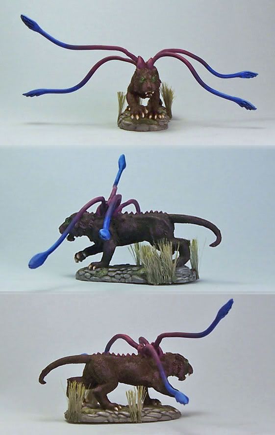
Here is my latest--got most of basecoating on. I have tried some preliminary highlighting of the black with some purple--whatcha think?   |
|
|
|
Post by Tim C on Jun 26, 2006 13:39:46 GMT
Looking good (though it is a very strange looking mini) tentacles look good at this stage.
|
|
|
|
Post by talonicus on Jun 26, 2006 22:23:22 GMT
he is looking good at the mo, although the right eye looks trange in the photo. I have to agree with Tim, that is a very very weird mini. Where is it from?
|
|
|
|
Post by endrem on Jun 27, 2006 8:16:18 GMT
The sculpt is indeed weird. I think also that the tentacles don't fit the colour of the animal itself. The animal looks quite naturally coloured, but the tentacles look supernatural with these colours. IMHO you should bring them closer somehow...
|
|
|
|
Post by jabberwocky on Jun 27, 2006 17:12:43 GMT
Thanks for the comments!
@tim and Talonicus--this is Reaper's version of the displacer beast I believe. The displacer beast is originally from (I think) Dungeons and Dragons. According to the fluff, it has the ability to bend light around itself, so it appears 2-3 feet away from its actual location. I have no idea why 4 tentacles would help with that. From what I have seen over at CMoN, other companies have usually made this thing with six legs.
@endrem--good suggestion. I think I am going darken the tentacles a bit so they aren't quite so bold, once I get them blended better. Again, according to fluff the creature is usually black, or at least the main body is.
|
|
|
|
Post by jabberwocky on Jul 12, 2006 15:08:42 GMT
Here is the phase cat nearly done. The fur looks better in real life, I think. It is a fair bit darker. I basecoated with black and highlighted with VMC royal purple and then purple. Any last minute suggestions?  |
|
|
|
Post by Tim C on Jul 12, 2006 21:07:12 GMT
as I said earlier this is a strange mini but I think the painting is great, one thing I would say is that the tentacles might benefit from some glazing over the blends.
|
|
|
|
Post by menace on Jul 12, 2006 21:21:27 GMT
You've really improved the 'believability' , it's looking great, i would just agree with tim, the transitions on some of the tentacles need to be softened out a little and you'll be on a winner  |
|