|
|
Post by jabberwocky on Jul 26, 2006 14:39:10 GMT
Nice--the yellow cast of the picture makes it tough to see the true colors, but I like him.
|
|
|
|
Post by sonny on Jul 27, 2006 14:50:52 GMT
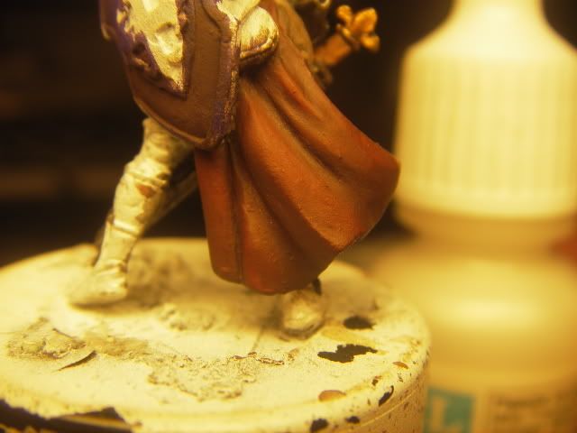
I started this mini yesterday.. the red is finished.. and no i dont want to highlight it again.. theres 6 layers already.. damn i hate my camera  |
|
|
|
Post by Tim C on Jul 27, 2006 14:53:22 GMT
You realy need to sort out the yellowing of your pictures as it is making seeing anything nearly impossible, but so far so good mate.
|
|
|
|
Post by sonny on Jul 27, 2006 15:22:53 GMT
is this better?  |
|
|
|
Post by Tim C on Jul 27, 2006 15:37:33 GMT
Much I can see the transition in the red much better now, looks smooth enough, you sure you don't want to highlight it again.  |
|
|
|
Post by sonny on Jul 27, 2006 16:28:58 GMT
|
|
|
|
Post by Tim C on Jul 27, 2006 16:42:39 GMT
Looks good sonny, in both pics. remember the morale that if you are happy with it then that is all that counts. To me the red looks fine.
|
|
|
|
Post by sonny on Jul 28, 2006 1:08:22 GMT
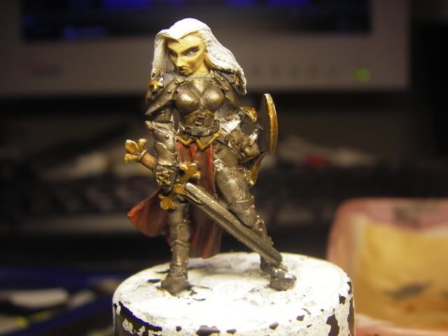
heres a pic from the front. sword, chest and gold on the shield. and the shoulder pad are finished. im working on the legs atm  |
|
|
|
Post by Tim C on Jul 28, 2006 3:48:48 GMT
Looks ok, I think you could do with some definition between the armour plates a little dark lining will help there. Also I think the metals could go a little lighter with more highlights. Still looking nice though.
|
|
|
|
Post by suladan on Aug 1, 2006 9:39:25 GMT
nice i like it  the red looks really smooth great job! |
|
|
|
Post by menace on Aug 10, 2006 19:13:49 GMT
Looks like you've sorted out your photo-gremlins so i'll not throw a spanner in the works  Have to agree with tim on the armour, it needs a little shading and defining, all else is coming along sweet |
|