|
|
Post by scarecrow4560 on Mar 13, 2010 20:03:24 GMT
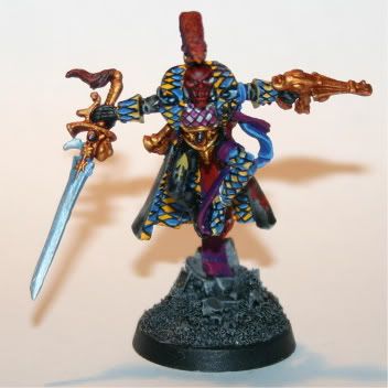
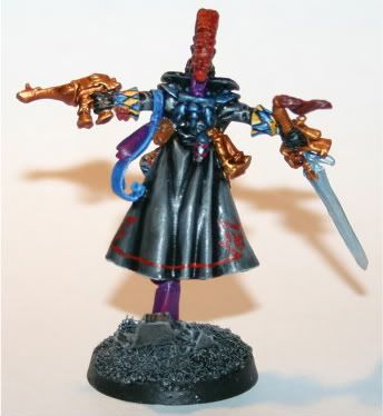
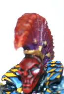
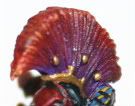
It's been a while since i posted, and i apologize for that. So as long as i've been in the hobby of painting mini's, i've always had a policy that i never repaint old minis, because it means i can look back and see where i came from. In the 7+ years i've been painting (on and off mind you) i have only repainted 2 minis. The reason i repainted this one was because at the local GW store, they are having a "Golden Goblin" compeition, which is pretty much a golden deamon but at the store. So i deicided i was gonna throw in my Harlequins (providing i get the rest done) and see how they do. Well, since i have my death jester done (and no extra time to repaint him) i i decided i would redo my troupe leader since he was...meh...on my first attempt. Here's my second attempt      My apologizes foe the poor close-up pictures. That white spot under his eye actually has a shape and isn't just a blob. |
|
|
|
Post by magie on Mar 15, 2010 20:15:21 GMT
I can only see the close-ups...
They look good, the transitions on the mohawk are very smooth, and the diamonds look really nice!
|
|
|
|
Post by dogfacedboyuk1 on Mar 17, 2010 1:56:45 GMT
Great diamond patterns and nice mohawk and cloak!!! The only thing I would say is do some more work on the metals as they look a little plain at the moment. Maybe some additional highlighting to bring that face out a little more as it seems, at least in the photo, a little dark. My fingers are crossed for you in the competition mate!!
dfb
|
|
|
|
Post by magie on Mar 18, 2010 12:49:56 GMT
I agree with dfb on the metals. Could use some extra shading. The diamonds look very good overall and the freehand on the cloak looks really nice. Great job on such a small mini!
|
|
|
|
Post by Tim C on Mar 20, 2010 8:24:41 GMT
Good work on the diamond pattern, as a lover of true metals paints I would agree with the previous comments on this area of the mini, the GW washes can make a world of difference there if used carefully, also gold looks great when highlighted by adding little amounts of silver into it. One other thing from my point of view is the face, the red is quite dark and for me doesn't give a good contrast against the brighter diamond pattern. I would have gone for a lighter colour more than likely a ghostly grey up to white. Other than that good stuff.
|
|
|
|
Post by bruenor on Mar 21, 2010 11:29:50 GMT
Great freehand work there, agree totally with the comments on the metals tho.
|
|