|
|
Post by jabberwocky on Jan 31, 2010 1:05:32 GMT
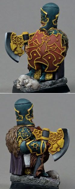
I'm working on a few minis for a charity auction over at WaMP. I'd love to hear some feedback! Here is a pair of zombie dogs from Armorcast. It will be part of a (hopefully) nice zombies vs. survivors chess set. These two will be the zombie rooks.  This next one is my first Scibor mini. I'll be venturing into unfamiliar territory with this one and will be attempting some NMM on the filigree. Any suggestions on what color to do the shield? I was thinking about keeping it in line with the armor proper, but that seems like a lot of green...the cape will be purple and (depending on time) will get some freehand.  If you have time, check out the WaMP site; this is a pretty large auction and there is a huge amount of prizes to be had for various categories. Many of the categories don't have an entry yet. The contest/auction will end on the 14th of February. Hit me with the critiques! |
|
|
|
Post by scarecrow4560 on Jan 31, 2010 2:02:38 GMT
Lookin great so far there Jabber!
The zombies are nice, but seem a little to...what's the word...fresh...for my taste. A bit of green or some sort of molding would make things look a little more rotten.
I like the dwarf, and i'm looking forward to see the NMM. The skin seems a little bright for a dwarf (again, that's personal taste). Maybe add a bit of red to the nose or something, that might help.
|
|
|
|
Post by Tim C on Feb 3, 2010 14:36:33 GMT
I like the dogs and the start on the Dwarf is pretty good too though I don't like the mini at all, looking forward to seeing these progress.
|
|
|
|
Post by magie on Feb 3, 2010 16:26:50 GMT
Really like the dwarf. The ornaments must be a pain to do, all those tiny edges. The hair and fur look really good!
I agree that the zombies could use some extra gruesomeness... but I like the muscle-colour a lot.
|
|
|
|
Post by jabberwocky on Feb 4, 2010 4:49:05 GMT
I have some more done on the dwarf:  The green on the helmet is the only part anywhere near completion. Slowly, but surely.... |
|
|
|
Post by bruenor on Feb 6, 2010 10:54:46 GMT
Looking good matey.
|
|
|
|
Post by scarecrow4560 on Feb 7, 2010 22:46:30 GMT
Comin along nicely there jabber!
|
|
|
|
Post by jabberwocky on Feb 13, 2010 8:32:16 GMT
Here's the next step on the dwarf. The shield is coming along nicely. I'm running out of things to do instead of the NMM...gulp.   |
|
|
|
Post by dogfacedboyuk1 on Feb 13, 2010 19:02:52 GMT
Hey jabberwocky - looking good! I like all the elements so far, cloak and fur especially. be interesting to see some nmm, havent the nerve to have a go myself yet! Scibor always does a good job on his painted versions of his sculpt (i ve probably said it before, but I do like his colourful painting style) so be interesting to see how this comes out!!
dfb
|
|
|
|
Post by jabberwocky on Feb 15, 2010 14:42:58 GMT
Nearly done with the steel NMM. I think I was able to get a smooth transition from pure white to pure black, although it looks to me like I need a few more passes of pure white in the second pic at the top. Any other suggestions to add realism to the axe blade? Are the reflection points accurate?  |
|
|
|
Post by magie on Feb 16, 2010 11:42:07 GMT
I think it looks really good. I've tried some NMM myself, and I think it's really hard. Especially to get the transitions smooth. Yours look really smooth and the reflection seems right to me.
You are right about the white in the second picture. Just a tiny spot of white will make the metal look shiny.
I'm looking forward to seeing the gold finished, those tiny edges must be a real pain...
|
|
|
|
Post by Tim C on Feb 21, 2010 16:53:50 GMT
The Dwarf is coming along nicely mate, the nmm is looking good but for it to really work it needs to be a bit smoother with a bit more more contrast towards white at the highspots, also there needs to be an extreme highlight along the top edge of the axeblade against the dark shade to make it pop (theory is great but these are the reasons why I don't do nmm) Like the zombie dogs alot too.
|
|
|
|
Post by mousekiller on Mar 9, 2010 12:47:29 GMT
Looks stunning so far Jabber... Only suggestion right now (more of a feeling) is to add a bit of a dark greenish wash to the fur on the back... just underneath the highlighted area where the shadow is... Again, not sure why, but that was my first thought  |
|