|
|
Post by skrit on Aug 17, 2009 13:06:02 GMT
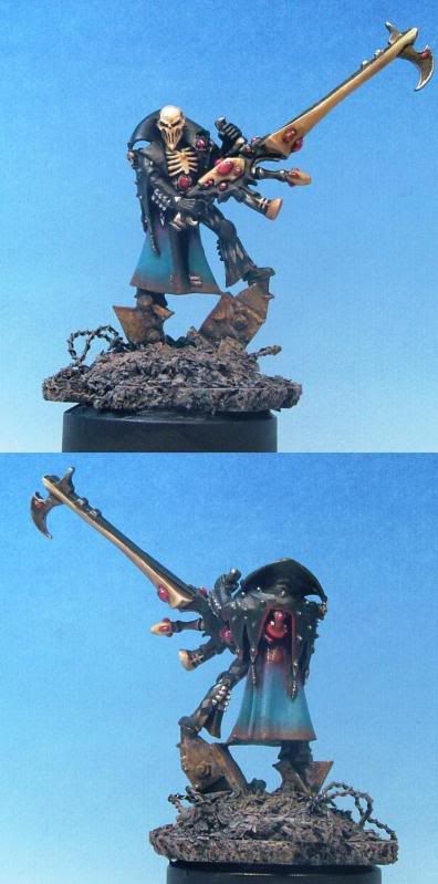
Hi, over at CofC we did our second mini exchange and this Harlequin Death Jester I painted for Nameless:  Pic taken by Phil, I've made some myself but unfortunatly cannot find the cable I need to upload from cam to computer. :bonk: The idea for the Death Jester was that his cloak represented the Aurora Borealis and the pins on his hood represent the stars in the skies. I also for the first time did some freehand (checker pattern) and also OSL which for a first time I am quite content with. I also made him a bit dirty (most Eldar I see are mostly very clean) as if he had been fighting hard in an urban area for a prolonged time. And if you care, votey linky to CMON: www.coolminiornot.com/229449Cheers! Tim. |
|
|
|
Post by scarecrow4560 on Aug 17, 2009 16:36:31 GMT
Looks fantastic! Very nice work on the freehand. I'll be honest, i'm a tad bitter since this is one of the models i'm working on and now i'm competeing with this beauty  |
|
|
|
Post by magie on Aug 20, 2009 8:04:28 GMT
Very nice! I always like harlequins, especially the dark sinister ones. You've done a great job here accomplishing that. Also, the base is wonderful.
|
|
|
|
Post by jabberwocky on Aug 21, 2009 7:20:57 GMT
Nicely done--the weathering is good and I like the basing.
|
|
|
|
Post by skrit on Oct 6, 2009 14:52:15 GMT
Hi, thx for the kind replies all! Srry it took so long to respond!  |
|
|
|
Post by dogfacedboyuk1 on Oct 7, 2009 8:58:41 GMT
Looks great mate, and it is nice to see some dirty eldar!!!
scarecrow, it's not a competition!!! Just paint yours up and show it to us, I'm sure it will be good!
dfb
|
|
|
|
Post by dennis on Oct 8, 2009 17:35:54 GMT
Have to echo the thoughts on the gritty appeal, excellent aesthetic in my book.. reckon the matallic gun barrel/whatever is a bit lacking in the same feel and contrast, imho i'd have a tone going from light to dark along it's length  |
|
|
|
Post by Tim C on Oct 9, 2009 12:17:55 GMT
hi Tim good to see you here again, I love the DJ but for me the weathering over the diamond pattern on the leg is a little too much and obscures it a little too much I know it is a taste thing but after all the work you put into it I would liked to have been able to see that part a bit better. It could just be an old man's eyes though not seeing it properly lol.
|
|
|
|
Post by bruenor on Oct 11, 2009 8:46:27 GMT
Look great, not so keen on the addition of the blue, but then I'm an old school kinda guy.
The weatherings great, if a little much over the chequers.
Great job overall tho.
|
|