|
|
Post by magie on Nov 13, 2008 19:28:03 GMT
Heeey everybody, Following the examples of some of you, I will make this thread my WIP blog. All comments & critic is welcome and very much appreciated as I want to learn how to paint with the same standards as you  So my first WIP is the empire wizard I didn't get to finish for the paint off. OSL is still out of my reach right now, but maybe one day I can make an attempt. 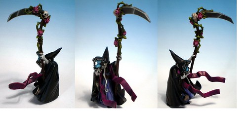  I still need to think about a fitting base and it needs some final work. Let me know what you think! |
|
|
|
Post by zapoteke on Nov 13, 2008 19:39:14 GMT
really solid work on this one MaGie! Jolly good!
|
|
|
|
Post by scarifice on Nov 13, 2008 20:09:05 GMT
I love the dark but bold colours.
But you should highlight the purple parts ab bit more. Maybe add a bit of white to it.
But becarefull, its not that easy to highlight something with white!
Furthermore you need some more variations/steps of grey in your NMM.
Maybe I find pic how you should paint it. I'll show it to you than.
Cheers
scarifice
|
|
|
|
Post by razhburz on Nov 16, 2008 18:56:43 GMT
looks great so far! keep it up  |
|
|
|
Post by josejarque on Nov 16, 2008 19:14:28 GMT
A paint job very nice
|
|
|
|
Post by Tim C on Nov 19, 2008 18:46:08 GMT
Very nice start I agree that some parts could do with a little more highlighting but that is only a very minor critique on what is a very solidly painted mini.
|
|
|
|
Post by coram on Nov 23, 2008 11:39:26 GMT
Very clean application and definition of areas, I would agree with the others that the highlighting needs a push
|
|
|
|
Post by magie on Nov 23, 2008 13:40:24 GMT
Thanks for your comments! They are very helpful  I will definitely work on the highlights. I don't want to overdo them, since I like a dark sinister look for this mini, but the purple does seem a little plain I agree. @ scarifice: As for the NMM, I know that the blending is awfull  . I tried it a few times, but I find it quite difficult to get a nice gradual highlight. It's only my first time painting metal NMM so hopefully I'll get the hang of it! Again thanks for the critic |
|
|
|
Post by jabberwocky on Nov 23, 2008 17:49:58 GMT
Don't have much to add to what has already been said. NMM is a tough thing to master; just keep at it an remember to use small increment of color change to smooth the blends.
|
|
|
|
Post by scarifice on Nov 28, 2008 7:38:10 GMT
You should try some kind of "trick" on the NMM.
First you paint it all in one colour for example Codex Grey(or even lighter!).
Afterwards you add the shadows (adding more Chaos Black) and than you add the lights.
The reason is it is much simpler to paint the shadows than to highlight the(from 0%-100% of light) whole skythe. This is the reason why you should start at almost 70% of the highlight.
If you have some steps in your highlighten you should layer it with the middle tone of your blending, than you will be able to erase them.
Hell, its difficult to discribe that in English. I hope you understood want I wanted to say
cheers,
Alex
|
|
|
|
Post by magie on Nov 30, 2008 15:47:40 GMT
I hope you understood want I wanted to say Absolutely understood, thank you! I will use your technique next time  For the moment I'm waiting for the base for the wizard to be delivered, so I have been experimenting a little bit with blending. Here's the result. (just for reference: for the most part it's not reflection of the desk light in the picture  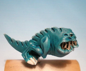 The light highlights still give me a lot of frustration, because you see the brushstokes so easily. Even if I use a very strong dilution. Watching some of the miniature mentor tutorials is helping a lot though. Any other suggestions for the bright highlights? |
|
|
|
Post by jabberwocky on Nov 30, 2008 19:13:09 GMT
I definitely have trouble with the brightest highlights as well--I would defer to the really good painters here, but one way to even things out is to glaze with the base coat color to smooth and unify the transitions.
|
|
|
|
Post by Tim C on Dec 1, 2008 14:34:49 GMT
I think it looks really good and the hot spot highlights look fine to me, you will always see brush strokes when using the layering technique one way to combat this is to use very dlilute glazes to soften the look.
|
|
|
|
Post by dogfacedboyuk1 on Jan 7, 2009 13:30:42 GMT
I like the wizard alot, the colours are good choices for this evil looking guy! But I agree with all the comments on additional highlighting being needed though and the nmm doesn't work, but as has been said its hard to do and i daresay i couldn't do it either at the moment
|
|
|
|
Post by magie on Jan 7, 2009 15:50:27 GMT
Thanks for the comments, they're very helpful. Using very dilute paint definetly helps Tim, but sometimes I am a little too impatient because it can take a while before you actually see a colour. But I'm learning thanks to you all! So I'd like to share some more WIPs. The process on the wizard is slow, can't seem to get it right. So here are some other projects. I'm a huge fan of the 40K ork line, and I am excited to see the new line arive in the mail next week. I've been trying some skin colours and this is my end result. Nothing really special, but for now it will do: 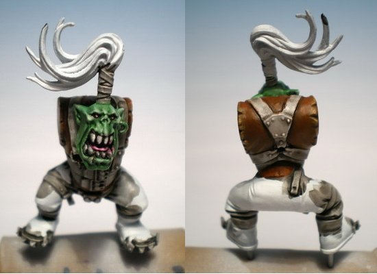 To practice some more dark colours I started this Dark elf shade. The cloak is actually more turquois and needs another highlight. 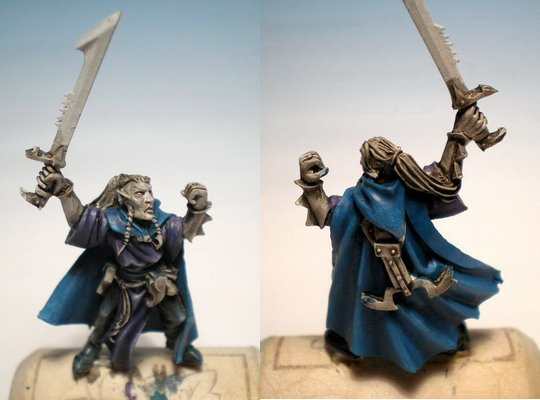 And to keep myself motivated: These are also some projects laying on my workbench. The elf mage will actually be my first 'commission' work  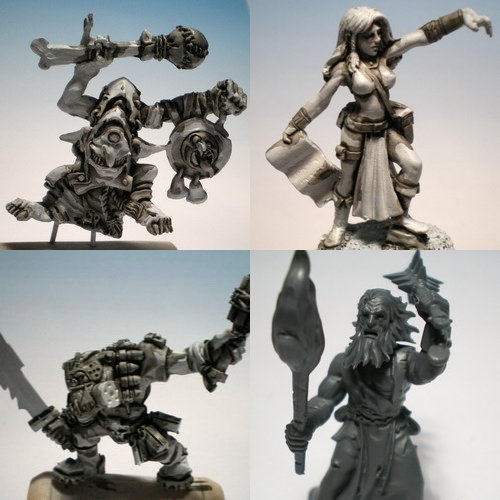 |
|
|
|
Post by Tim C on Jan 7, 2009 16:04:44 GMT
You are doing some really cool stuff at the moment, I like the way you are undercoating white and then washin over in dilute black (I presume that is what it is) that is not too far away from how we used to do it years ago and we used to call it black washing funnily enough, I know what you mean about being impatient I still get that even now and I also get fed up with minis very quick if they are not going how I think they should be.
The ork is nice and I am a big ork fan too the skintone looks pretty damn good to me all in all you seem to be making big forward steps on your work.
|
|
|
|
Post by jabberwocky on Jan 8, 2009 5:28:34 GMT
Coming along very nicely, MaGie! The skintones on the ork are very nicely done. I'm betting they look even better in person--I think the photo and/or the background may be washing the colors out a bit.
|
|
|
|
Post by magie on Mar 1, 2009 17:37:14 GMT
Finally I was able to paint a little... Starting painting the skin of the goblin banger. I really like this funny mini. Have been experimenting with a different skin colour...   And something I didn't post yet, some progress on the ork boy. 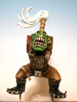 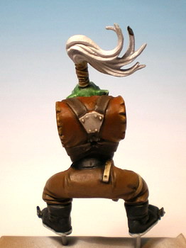 I would like to know what you think so far! Oh by the way thank you all for the previous comments. Tim you were right that I use a black wash. I do this so that I can better see the transitions between the different parts of the mini. Generally, I try to make the real shadows in colour instead of black. |
|
|
|
Post by Tim C on Mar 1, 2009 17:46:09 GMT
The skin on the Goblin musician looks ace as does the 40K Ork I am looking forward to seeing both of these progress.
|
|
|
|
Post by dogfacedboyuk1 on Mar 1, 2009 19:46:19 GMT
Impressive skintones magie! Keep the pics coming!
|
|
|
|
Post by jabberwocky on Mar 2, 2009 13:15:06 GMT
Very good stuff, Magie! Glad to see you have had a bit of time to get back to the brush. The skintones are looking great. One nitpick, if I may. The skintones on the goblin are very well done, but are uniform from top to bottom. Add just a bit more highlighting to the head and raised hands, or conversely tone down or increase the depth of shading on the lower portions off the model.
|
|
|
|
Post by magie on Apr 12, 2009 14:52:04 GMT
Made some progress on this Dark Elf Shade. I still need to finish the sword handle and the hair. Overall I'm quite satisfied, although the skin looks a bit too reddish to my taste. In retrospect, I should've sanded the blade better, because the irregularities show a little. 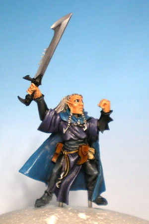 Would like to hear your comments and criticism, it really helps me a lot  |
|
|
|
Post by Tim C on Apr 12, 2009 15:16:38 GMT
Looking good so far, the blade especially is looking top notch. At this moment I can't tell if it is NMM or real metallic. I would put a little more work into the face wit ha bit more shading and highlighting to give it some depth. I know that elves are supposed to be fair skinned but I think that faces look better with some definition to them.
|
|
|
|
Post by magie on Apr 12, 2009 15:26:53 GMT
Thanks Tim! The blade is NMM, guess it worked out quite fine. I re-painted it several times, cause blending is very difficult with grey/white IMO. I think I'm gonna repaint the skin entirely, the orangeness just doesn't work for me  |
|
|
|
Post by Tim C on Apr 13, 2009 8:59:43 GMT
Well I think you've nailed the nmm that is still something I can't pull off. I wouldn't necessarily repaint the flesh I would just work at it to make it a little more convincing, adding a little grey into flesh works well as well as thinning down the purple wash and using that sparingly that also yields good results too.
|
|