|
|
Post by scarecrow4560 on Aug 24, 2008 23:19:25 GMT
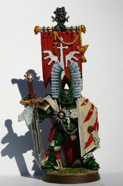
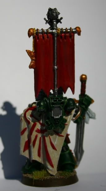
Heres a Dark Angels Company Master I completed. I'm quite proud of it, as i am with all my models. I finally found a good way to photo these, although the back view could use more light. I was taking these outside and it seemed to work much better then my last set of photos. Tell me what you think    I'm also nearing completion on my Wurrzag model so hopefully i'll have some pictures of him up soon. |
|
|
|
Post by zapoteke on Aug 25, 2008 20:45:40 GMT
yup, good photo, showing what it's supposed to.
A clean neat paint, I would say around a good tabletop mini quality. I'm not to keen on the glossiness, don't know if it's due to some inking or if it's a sealer. If it's meant for tabletop I can see why the sealer, but you could go for one thin coat of gloss and then a matt one to bring down the shiny...
Good work! and bring em on...
|
|
|
|
Post by lee on Aug 29, 2008 21:38:56 GMT
good work bro, i've never been a fan of very sharp highlighting, prefer blends myself.
but for tabletop work it's ace =] hope to see more!
|
|
|
|
Post by jabberwocky on Aug 30, 2008 16:30:31 GMT
Good work on this one! I like the freehand on the cape.
|
|