|
|
Post by scarecrow4560 on Jul 21, 2008 13:08:46 GMT
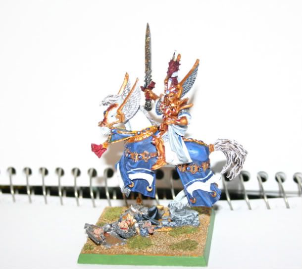
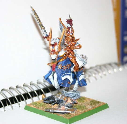
This is my first miniature post and though its not the best, i'm still proud of it. The photos may be a tad big...i'm still getting used to photobucket and resizing and what not...   I'm still trying to find the best way to photograph these. I have an idea but i haven't tried it yet. If you guys have any tips for paint/photography/whatever else you can think of, please, let me know Cheers guys! |
|
|
|
Post by Tim C on Jul 22, 2008 8:19:40 GMT
Overall not s bad mini, i think that you need to change your background as a plain white backdrop is just not helping here, also are you using your flash on your camera if so don't as that also washes out the picture. A good light source i use a flourescent lamp as it gives a more even spread of light and a blue to white gradient are the way I normally go.
|
|
|
|
Post by jabberwocky on Jul 22, 2008 12:14:18 GMT
Tim has covered most of the suggestions I would make. The white horse on the white background really washes out the mini and I would bet isn't accurately showing off your efforts. I like the color scheme and the freehand bits on the barding are a nice touch.
|
|
|
|
Post by scarecrow4560 on Jul 22, 2008 16:10:37 GMT
Thanks for the input. I have a few backgrounds i want to try but my light source isn't that good. I'll try to get my hands on a florescent light. Thanks again  |
|
|
|
Post by bruenor on Jul 22, 2008 18:21:21 GMT
From what I can see it looks like a cool paint job, nice job.
Hope to see some clearer pics soon!!
|
|
|
|
Post by razhburz on Jul 23, 2008 8:44:59 GMT
It looks good from what I can see  all tips about the photo I was going to give you have alredy been said. looking forward to see more form you! |
|
|
|
Post by chemicalcaveman on Jul 24, 2008 11:13:05 GMT
I don't know how much funds you have access to you, but I recently bought a portable photo studio in maplin for about €30. I very pleased with it as it gives a nice blue backround with out having to mess around in photoshop.
As for the mini, it looks good to me as has been pointed out the white backround makes it difficult for the camara to focus. But you seem to have everything there in what looks like a solid mini. Did you say this was your first mini? If so congrats on taking on such an ambitious model!
|
|
|
|
Post by scarecrow4560 on Jul 24, 2008 16:51:36 GMT
Its not my first miniature ever painted, but it is definitely the most complicated, which is why i was extremely proud of it and wanted to show you guys. It took for freakin ever! My next model, Harry the Hammer, will likely take even longer. I'm currently working on a Wurzzag model so i'll hopefully finish that soon...
Funds aren't an issue for me, so i'll look into that studio you mentioned.
|
|
|
|
Post by scarecrow4560 on Sept 15, 2008 6:32:44 GMT
|
|
|
|
Post by Tim C on Sept 15, 2008 8:02:03 GMT
Overall the mini is good, the trouble with clearer photo's is that they show up the areas which let down models more so here is what I think could be improved. First and formost is the highlighting on the horses barding, I think you need to take time and look at how lights and shadows actually fall on cloth the highlights are to abrupbt and buy that I mean there isn't a smooth transition between the darkest and lightest areas whilst it doesn't look that bad it could be alot better with smoother transitions in colour.
Tim C's Top Tip[/u]
When I decide on a coloour I take the base tone and dab a bit on my pallette, then I place the lightest tone a few cm's away on my pallette that gives me a starting point and a finish point for the colour, all I do then is mix from base to final highlight inbewtween the too swatches and this lets me see the gradual increase in highlight tone and I can better control the highlight process. Also keeping the paint thin helps too.
The second area I can see to improve is the definition between areas, like the dead Elf the armour plates could look 100% better with some dark lining between the amour plating and also on the shield where the metal edge meets the padding.
Now I've just pulled it to pieces I am going to say that it is still a nice job.
|
|
|
|
Post by scarecrow4560 on Sept 16, 2008 2:11:37 GMT
That is a fantastic tip Tim, thank you very much for it. I'll put it to (hopefully) good use.
For the dark elf armour, since that was the first part i ever did, i wasn't super at highlighting (not that i really am now but you get my point) so i didn't pay too much attention but a simple watered down black wash i'm thinking could fix that easily.
For the barding, your technique sounds the best so i'll have to give that a go one of these days.
Thanks for the great advice ^.^
|
|
|
|
Post by jabberwocky on Sept 19, 2008 0:26:22 GMT
Fine work on this one, SC! Tim, of course, had some great bits of insight there.
|
|