|
|
Post by jabberwocky on Feb 7, 2007 4:02:21 GMT
Here is the other fella which I have been primarily focusing on the skin (for which I'll use to put together a little tutorial once I am done). I have added the next layer of highlighting to the skin--VMC Golden Olive. The burned flesh is starting to show up nicely, I think. For those of you keeping track, here is the progression: VMC Black, VMC Flat Green, VMC SS Camo Bright Green, and now Golden Olive. 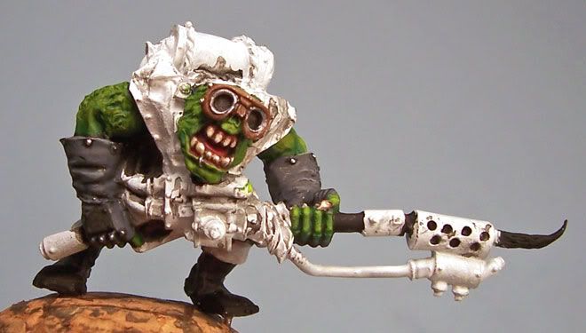 |
|
|
|
Post by mminiatures on Feb 7, 2007 4:35:45 GMT
The skin highlites are showing up very nicely, good job. I assume those are stitches or something on his right arm which are yet to be painted?
Thats one depressing sig you got there jabberwocky!
|
|
|
|
Post by jabberwocky on Feb 7, 2007 4:55:55 GMT
I have started altering the flesh tones a bit. I have kept the Golden Olive as the "base", but started lightening it up with RMS Desert Sand (a pale yellow) for the "healthy" skin and RMS Aged Bone (a light gray) for the burned skin. The photo don't quite do it justice, unfortunately, but hopefully as I add more Desert Sand and Aged Bone, respectively, it will become more obvious. 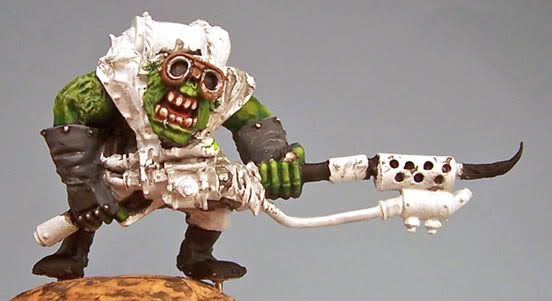 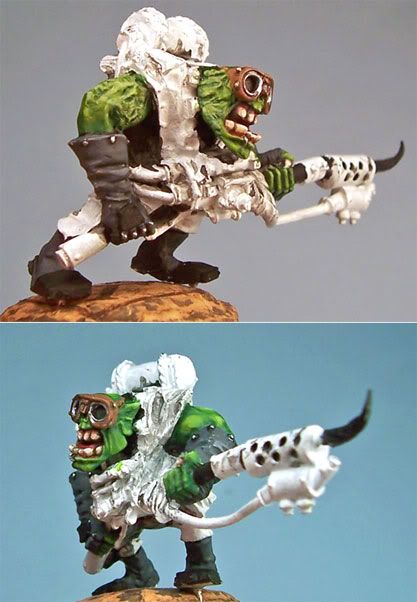 @mminiatures--hehe yeah. I found it to be very apt for me, though. I am a bit too much of a perfectionist. I can spend days tweeking and touching up a mini; I find that eventually I have to just call it done and move on, rarely calling it "completed". |
|
|
|
Post by mutantpotato on Feb 7, 2007 7:35:44 GMT
I am a bit too much of a perfectionist. I can spend days tweeking and touching up a mini; I find that eventually I have to just call it done and move on, rarely calling it "completed". I know how you feel, I have that "problem" too. I can spend days trying to get even the smallest things right. I have even ruined paint jobs because I have tuoched it up too much  Both of the orks look awesome so far, and I like everything. The flaming on the helmet and the "CIN" letter are some wonderful details. And of course the burned skin is an awesome and original idea. |
|
|
|
Post by Tim C on Feb 7, 2007 7:49:46 GMT
Looking great mate, it is good to see regular WIP shots going on here and I think we could do with a few more from other participants.
I intend to start mine as soon as I have my new glasses and as soon as I do have them I will post a regular WIP thread like this.
Nice work so far Jabber.
|
|
|
|
Post by razhburz on Feb 9, 2007 9:05:37 GMT
great job on the skin mate  |
|
|
|
Post by menace on Feb 9, 2007 9:59:38 GMT
What about some contrasting purple washes around the burnt skin area  Just a thought to differentiate  |
|
|
|
Post by jabberwocky on Feb 12, 2007 16:01:49 GMT
What about some contrasting purple washes around the burnt skin area  Just a thought to differentiate  Done. I think it worked very well. Thanks, Dennis! I finished the skin by going up to RMS Linen White and then went over selected areas again with a very thin glaze of the VMC SS Camo Bright Green to smooth the transitions a bit. I'll get a tutorial up later today. 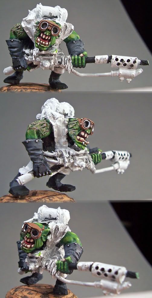 |
|
|
|
Post by Tim C on Feb 12, 2007 16:13:41 GMT
Nice, that is a very nice skintone indeed.
|
|
|
|
Post by matty1001 on Feb 12, 2007 16:33:55 GMT
Great scarred skin! And those gloves look very nicely shaded and highlighted!
|
|
|
|
Post by jabberwocky on Feb 12, 2007 17:04:39 GMT
Thanks for the compliments, guys.
The skin tutorial is done and over in that section once it is cleared by the mods (i.e. Tim has looked over it and found it satisfactory) ;D.
|
|
|
|
Post by Tim C on Feb 12, 2007 17:27:05 GMT
I'll give it a read and then put it up asap.
|
|
|
|
Post by razhburz on Feb 12, 2007 20:08:50 GMT
I love that burned skin mate  its sooo cool |
|
|
|
Post by jabberwocky on Mar 2, 2007 14:59:50 GMT
Got some additional work done on the boyz since the Wyrd contest is over.  |
|
|
|
Post by Tim C on Mar 2, 2007 16:44:58 GMT
Great to see you back on these guys again mate, I will be making a start on mine very soon.
|
|
|
|
Post by razhburz on Mar 2, 2007 18:48:30 GMT
mmm lovely  he looks great o far mate  |
|
|
|
Post by jabberwocky on Mar 4, 2007 13:25:49 GMT
Coming along, coming along...I was a little frustrated by the bag underneath the tanks (Bone triad) as it blends too much with the rags (light browns highlighted with RMS Desert Sand and Linen White. Back to the drawing board...any suggestions? Oh, also I was wondering about the goggle lenses. I am going to make them red and just have down a very dark red as a base at this point. The lenses are recessed, so should a reverse the highlighting and put the light reflection on the lower half and shade the upper or do it the standard way?  |
|
|
|
Post by Tim C on Mar 4, 2007 13:45:06 GMT
It is indeed coming along very nicely mate I see what you mean about the bag, I would suggest a good dark red that would give excellent contrast to the rest of the mini, otherwise this is superb.
|
|
|
|
Post by jabberwocky on Mar 4, 2007 14:04:08 GMT
It is indeed coming along very nicely mate I see what you mean about the bag, I would suggest a good dark red that would give excellent contrast to the rest of the mini, otherwise this is superb. Good thought, but I was going to make the tanks and orangy-red similar to the top tank on the other boy; do you think that will be too much red? And any thoughts on the goggles? |
|
|
|
Post by menace on Mar 12, 2007 14:02:16 GMT
I think you could easily vary the reds between the tanks and the bag so they look effective, possibly a deep brown/red for the bag and a fire-extinguisher/ orange red for the tanks  I don't have much of an idea about the goggles, if they were mine i'd go for a dark angels green as in a welding mask and as the lens is recessed have the light shade towards the bottom but possibly no 'glints'... |
|
|
|
Post by jabberwocky on Mar 12, 2007 15:10:05 GMT
Good thoughts....good thoughts...here is the color scheme I went with--all basecoated only. I just wanted to get an idea of what everyone thought. Not too much red/orange? 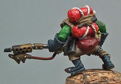 |
|
|
|
Post by Tim C on Mar 12, 2007 15:19:06 GMT
Good start I think I would darken the bag a bit more but still should look good when done.
|
|
|
|
Post by racssirt on Mar 12, 2007 15:39:00 GMT
Yeah, the bag is a bit to bright at the moment but other than that it is top notch mate!
|
|
|
|
Post by razhburz on Mar 12, 2007 18:02:53 GMT
as already been said its a bit bright but I like the idea of red  the mini looks awesome  |
|
|
|
Post by jabberwocky on Mar 29, 2007 6:42:17 GMT
Nearly done with this one. I hope to get him based in the next couple of days.  |
|